Case Studies
Colouring Bridgerton
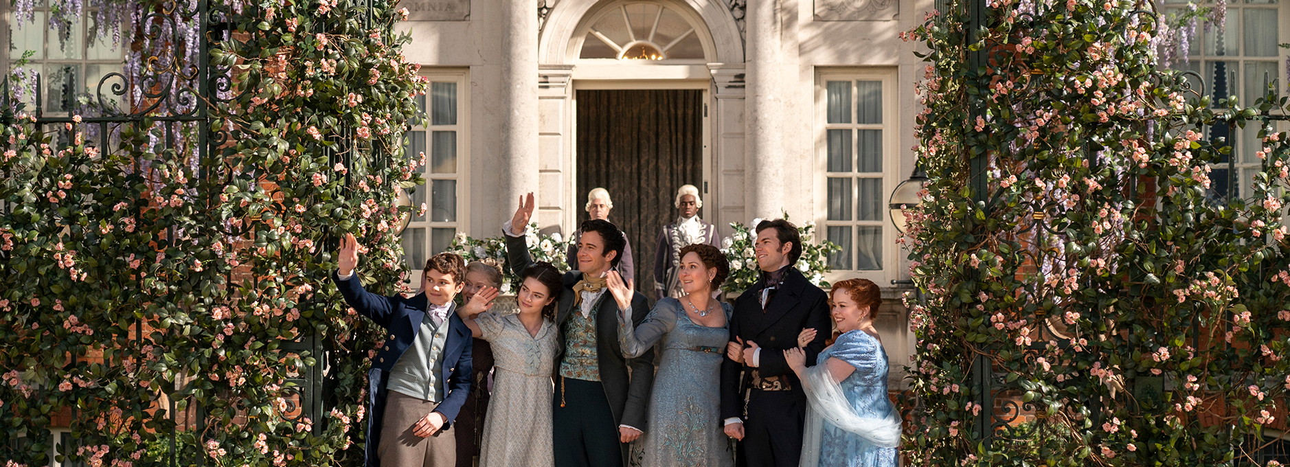
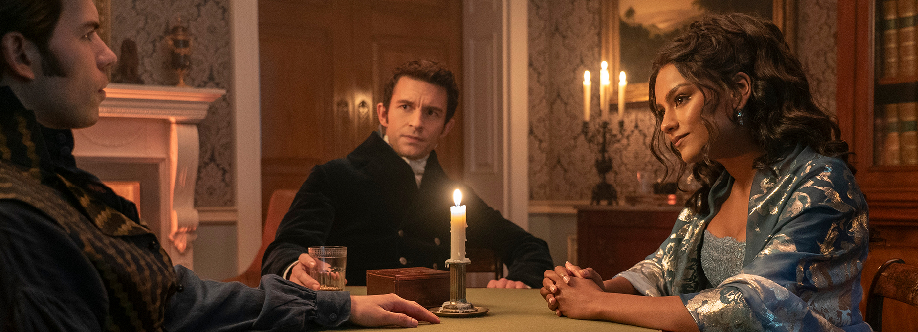
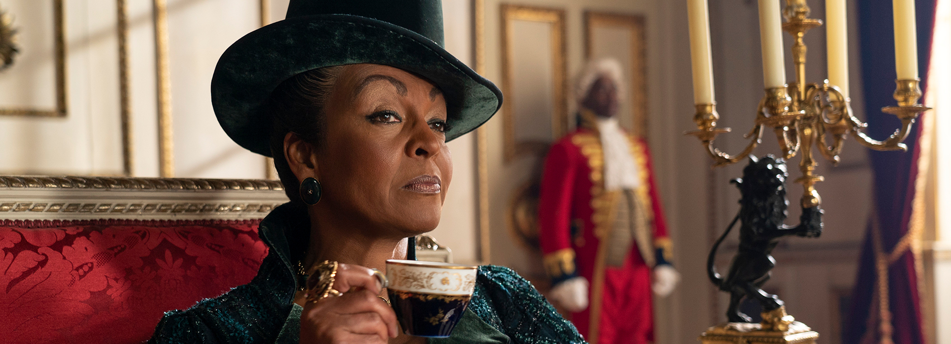
Bridgerton is Netflix and Shondaland’s popular period drama series. Set in Regency-era London, it is inspired by the book series by Julia Quinn and follows the lives of the wealthy Bridgerton family as they navigate high society, romance and scandal.
Season three was released in May and June 2024 and quickly entered Netflix’s official list of all-time most popular English-language TV shows at No. 10, earning 91.9 million views between May 16 and June 30.
The complete series was helmed by multiple directors and cinematographers, including Jeffrey Jur, who has been the lead DoP across all three seasons. Responsible for the colour was Pankaj Bajpai at Picture Shop in LA, whose collaboration with Jur spans almost 20 years.
Pre-production
Bajpai is a big believer in starting colour work as early as possible, to help forge relationships with key creatives – especially for a big show like Bridgerton.
“There are plenty of crucial factors that play a major role in the visual aesthetic of a film or show,” says Bajpai. “The production designers, make-up artists, actors, lighting, and direction are all a key part of creating the visual appeasement for the viewer. It is not a singular act of the colourist but a collective process that involves the combination of many different minds.”
“This is why I always try and get deeply involved at pre-production,” he adds. “For example, I am currently working on a show where production designers, wardrobe, DoP, executive producers and directors have already spent hours in my room – and they are still three months away from starting to shoot.”
Creating a look
Jur and Bajpai worked closely together on the look of the series, early on discussing the creative and visual goal for the unique show.
“For us, it was all about the creative process and we quickly began discussions about what we were going to do with a show which was set in 19th century England, but has Lady Gaga tunes in it,” comments Bajpai. “We talked about how we could get that jump to happen visually while complementing what we were trying to do.
“It was also a very interesting project for me because there are so many diverse elements to it,” adds Bajpai. “It features actors and actresses from all kinds of ethnic backgrounds with a variety of skin tones. To put all these elements together was very exciting for Jeff and I.”
Bajpai and the team did not look to a particular show or visual style as a reference for Bridgerton, instead building a look entirely from scratch.
“There wasn’t really a reference for a subject matter like this,” says Bajpai. “With Bridgerton, Shonda Rhimes created something that had never been done before – she brought together multiple races, ethnicities and cultures. There was no visual reference for this, so we built the look based on the needs of the show.”
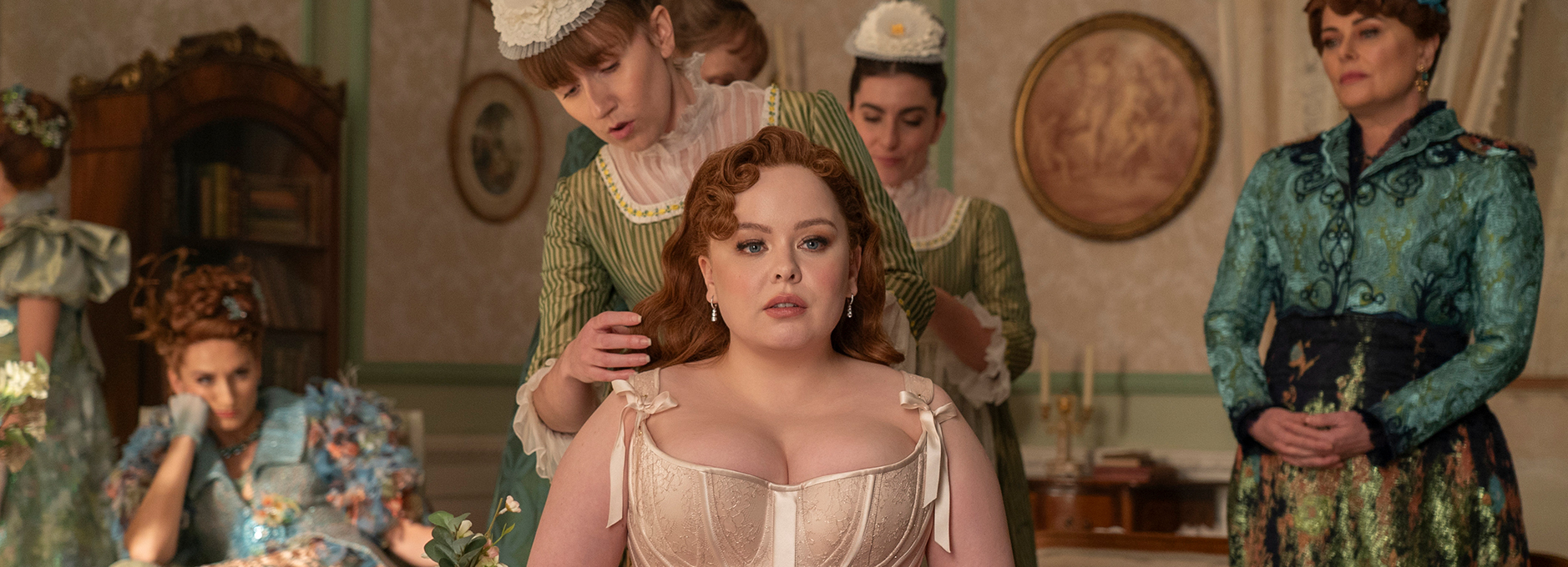
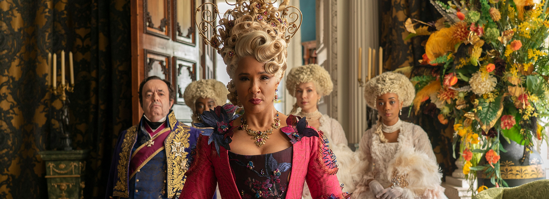
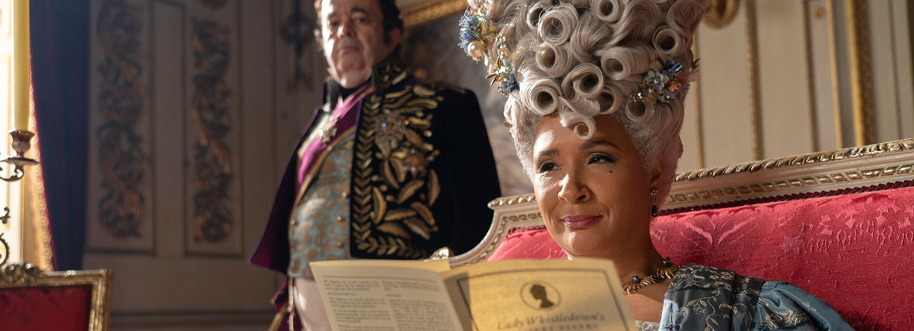
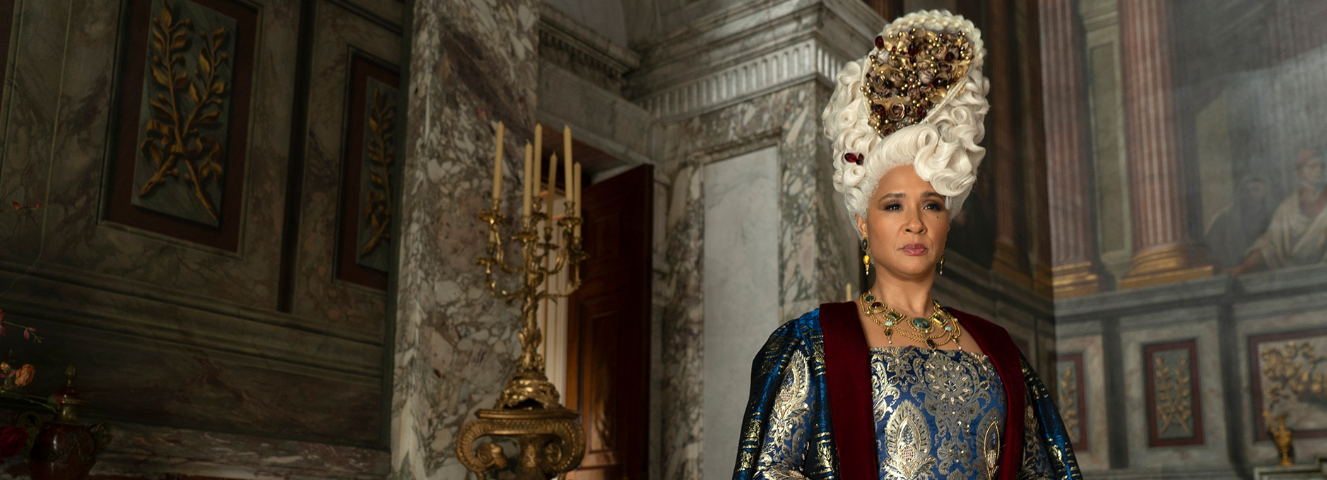
“For example, there are over 7,000 pieces of costume in just the first season,” explains Bajpai. “Everything is meticulously put together based on what fabrics matched the actor or actress’ skin tones. So, in the look, we wanted to highlight the fantastic wardrobe in place, but also the hair, make-up and other key props like the queen’s wigs. The production team was shooting scenes in incredible ancient locations with real structures, but the creations inside them were completely fantastical, so we were keen to ensure everything stood out.”
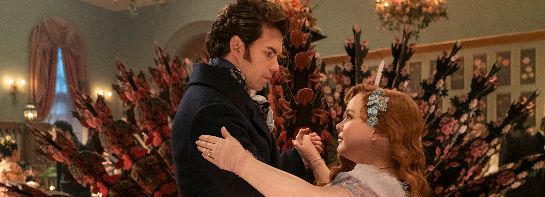
“It was largely about creating the right atmosphere on set and in post, to create what the show needed – it had to feel real, glamourous and attractive,” says Bajpai.
“The main focus for us was to make sure everything popped,” says Bajpai. “It was fairly simple, and we didn’t sit for hours analysing references or seeking inspiration. I guess that’s the benefit of having worked with someone for so long – we just said ‘OK, we’ve got to make all of this pop’, and that was fully understood.”
Evolving LUTs
Bajpai likes to work with LUTs to support the vision from production through to post. For series one of Bridgerton, he used Baselight to develop a set of LUTs which have now been utilised across all seasons.
“The look we were aiming for was fairly simple, but simplicity can be hard,” adds Bajpai. “To help with look development, when I was working on season one, I built four LUTs to be used in production. I enjoy working with LUTs, as they put the look in the camera on-set, so you can see how those colours will translate and what the show will be. This means there are no surprises later and gets everyone on the same page.
“And the four LUTs I built for season one are still being used on the current series – of course they’ve evolved slightly with the content, but they have been utilised throughout,” says Bajpai.
“For example, at the beginning of season three, there is an episode set entirely in moonlight – the moonlit ball. This episode required its own look, so the LUT and the process had to evolve slightly. The challenge for us was to maintain the richness and honesty to the colours and fabrics, faces and skin tones, while giving the specific scene what it needed,” says Bajpai.
“And, of course, during final finishing we still get creative and try to build on everything that was filmed using Baselight and its new and evolved tools – but the essence of the LUTs have been the same throughout.”
“The Chromogen look development tool was incredibly useful,” adds Bajpai. “Looking ahead to season four of Bridgerton, I'll be refining and updating some of the LUTs, with Chromogen playing a significant role in these changes.”
Audience expectations
Another challenge for Bajpai was to create a consistent look for the viewers, while honouring the creative perspective of the show’s multiple directors and DoPs.
“Every DoP has their own style, which I want to honour,” says Bajpai. “But, at the same time, the show is its own brand now, and the audience has a level of expectation. It’s very important that when we are in the final stages of finishing, that we make sure not to homogenize anything, but to meet the audiences’ expectations.”
Bajpai utilised the new Flare tool in Baselight as well as the latest version of Curve Grade to ensure he maintained this familiarity and consistency, even throughout the challenges of the UK weather.
“Utilising tools like Dfuse, Halation and Flare adjustments has been crucial, especially when filming in England with its unpredictable weather and seasonal changes – they help to ensure Bridgerton maintains a consistent visual atmosphere.”
Bajpai also had to maintain this brand consistency throughout the constantly developing narrative.
“If you compare episode one of Bridgerton to the last episode of season three, you’ll see that gradually and organically the look has evolved,” says Bajpai. “It’s developed in keeping with the story, as the narrative in season one was very different than season two, where you have all the Indian actors, for example. This brought in multiple elements of the Indian culture, which we wanted to celebrate.”
“And, on that note,” adds Bajpai. “To the credit of Shondaland, they were not shy about bringing in all these elements of the Indian culture,” adds Bajpai. “On the surface, it feels like a beautiful, rich show, but there is a lot of thought going into it and particularly the cultural sensitivities that Shonda is touching on.”
HDR and SDR passes
The workflow has remained much the same across all seasons, from conform to finishing and VFX. However, the handling of the HDR has evolved slightly. The HDR version was delivered in Dolby Vision and Bajpai worked hard to ensure the viewers experience was not altered in HDR compared to SDR.
“For the HDR pass, we wanted to bring back the simplicity aspect of it so the audience can see how beautiful it is rather than it being overly saturated or blinding,” comments Bajpai. “It's about maintaining a balanced atmosphere.”
“When shooting with lamps and through atmospheric conditions like mist or ocean views, it's crucial to preserve the softness and natural feel. Transitioning to HDR can sometimes overwhelm these nuances, causing lamps to glare and altering skin tones and contrasts. This can disrupt the intended viewer experience so one of my challenges was to ensure these elements remained consistent and preserved.”
To support this, Bajpai utilised Baselight’s Base Grade tool and its integration with film grading techniques.
“Base Grade was critical for creating custom LUTs tailored to each shot within HDR's technical constraints,” Bajpai comments. “This approach allowed precise control over brightness values and texture enhancement, crucial for maintaining a consistent viewer experience while enriching the HDR visuals.”
A collective process
“It’s not just about the colour,” says Bajpai. “Our creative goal is to take all the hard work that goes into the show and bring it to a visual space that feels consistent. Everything together must work in harmony, and that’s how we succeed. I’m not doing this on my own, I’m standing on the shoulders of a lot of people. It’s a truly collective process and that’s what is the essence of it all.
“Shondaland gives you all the resources and time that is needed,” concludes Bajpai. “It is a great team to be a part of and I thoroughly enjoy working on the colour on Bridgerton.”
The complete series of Bridgerton, including the latest series (three), is now streaming on Netflix.
“With ‘Bridgerton’, Shonda Rhimes created something that had never been done before – she brought together multiple races, ethnicities and cultures. There was no visual reference for this, so we built the look based on the needs of the show.”