Case Studies
Creating two distinct looks for Disclaimer
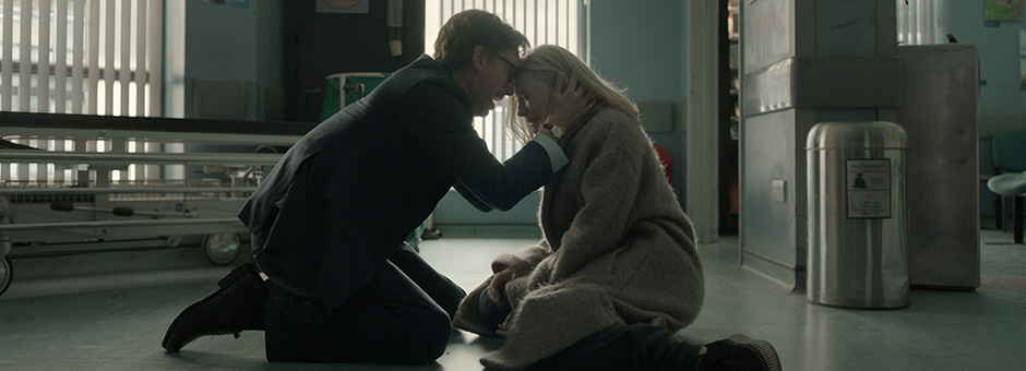
Disclaimer is a 2024 psychological thriller series, written and directed by Alfonso Cuarón, based on the 2015 novel of the same name by Renée Knight. The seven-part Apple TV+ drama, which received its world premiere at the Venice Film Festival and was shown in two parts at the Telluride Film Festival, is now streaming on Apple TV+.
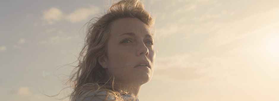
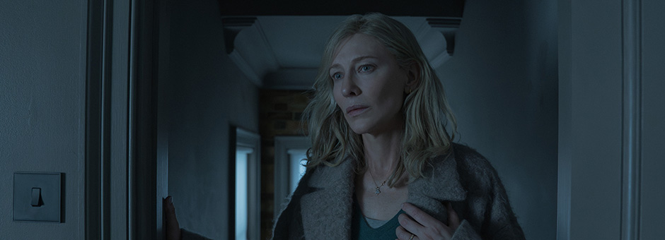
The series follows the documentary filmmaker by the name of Catherine Ravenscroft, played at different stages of her life by Leila George and Cate Blanchett, whose “mask falls” when she receives a manuscript of a supposedly fictional tale.
The series was shot by cinematographers Emmanuel Lubezki, ASC, AMC (‘Chivo’) and Bruno Delbonnel, ASC, AFC, and the colour was delivered on Baselight at Postworks NYC by supervising colourist Peter Doyle (now Picture Shop).
‘Innovation of the digital process’
Doyle’s collaboration with director Cuarón and DoP Delbonnel stems back to his work on the Harry Potter movies – working with Alfonso and DoP Micheal Seresin on Harry Potter and the Prisoner of Azkaban (2004), and then with Delbonnel on Harry Potter and the Half-Blood Prince (2009).
For Harry Potter and the Prisoner of Azkaban, Alfonso and Seresin wanted the theatrical release film prints to utilise Technicolor’s ENR process.
“This photochemical process, whilst very beautiful, is demanding in terms of lab controls and repeatability,” says Doyle. “More so as the print order was over 20,000 release prints, split across four labs worldwide. The brief was to emulate this optical process in DI – Bruno wanted the film’s optics to behave as if all wide lenses had the bokeh of a long lens. And for the flashbacks to appear as if they were shot on shift / tilt.”
“The relationship evolved as each of our internal processes for breaking down a design or look for a shot morphed from referencing the common language of photochemical process into the somewhat liberating idea that we can build our own tools and define our own processes,” says Doyle. “It was less ‘renovation of the chemical process’ and more, ‘innovation of the digital process’, you could say.”
Defining the workflow
Doyle started camera testing in late 2021. Chivo and Delbonnel were shooting on the new ARRI S35 camera, which was still in beta at the time, and Doyle worked closely with the team to clarify the parameters and limitations for colour.
“FilmLight built an SDK for the beta ARRI camera, almost overnight,” recalls Doyle. “ARRI’s design team were on-set tweaking final parameters of calibration. Peter Marsden, our DIT, was also on-set getting colour, calibration and monitors sorted. And Chivo and Bruno were defining their lighting plans, based on the new camera and testing.”
The team worked closely together to agree collectively on the process and align on what they were making, at least conceptually.
“Alfonso’s stance was that we were making a feature film – albeit a long one,” explains Doyle.
The team were to deliver to Apple an HDR master, with a Dolby 709 trim, but retain the ability to deliver screening and festival versions in 709 and DCI.
After much experimenting, the team agreed to do the final grade in HDR, but on-set monitoring and editorial was completed in SDR.
“We wanted it to be a fully managed workflow from set to screen,” says Doyle. “So, the look on set, as seen by Alfonso, Bruno and Chivo, was to be maintained through to editorial and final grade. The final grade was then about matching and refining rather than rebuilding looks.”
Creating a look
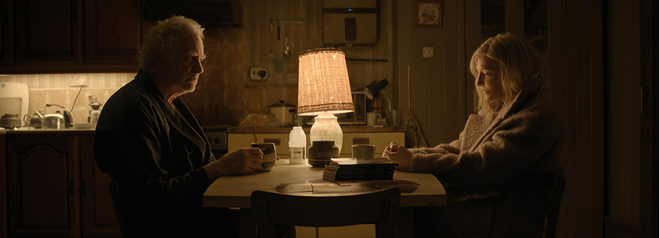
“The story is told from two perspectives, set in the present and the past,” says Doyle. “Bruno shot Stephan’s story and Chivo shot Catherine’s story.”
Each story was considered standalone and there was an agreement that each DoP would not see the other’s work. They each carried their own lights, lenses and LUTs so the only common factor was the camera.
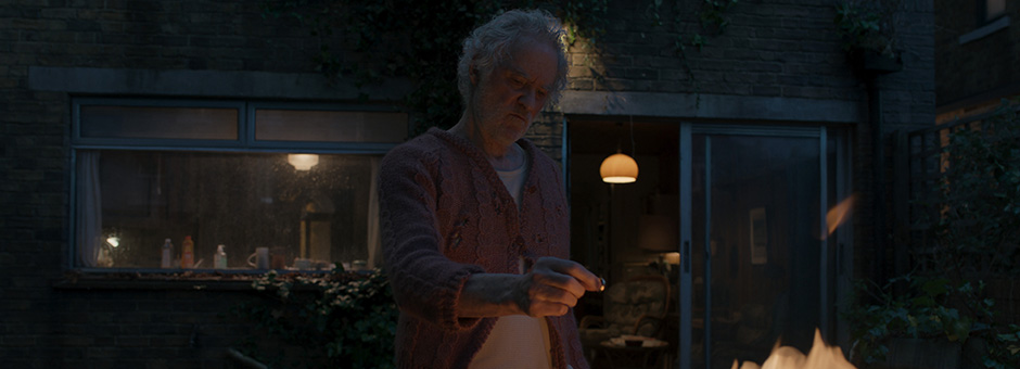
“The creative brief was to make the visuals as visceral and poetic as possible,” says Doyle. “The guiding philosophy was that Catherine’s world was elegant and posh, while Stephan’s was working class and a little rundown,” explains Doyle. “Overall, Alfonso wanted a sharp, believable look with a clear delineation between past and present.”
Doyle described the visual references as “more descriptive, than prescriptive.”
“Alfonso worked very closely with production design and each DoP to define the look and colour palette,” Doyle adds. “How the camera read the colours on set, and how the LUTs reacted to these colours was constantly being tested.”
During initial testing of the S35, the team also built differing custom textures for each DoP.
“Bruno shot with Master Prime lenses, while Chivo shot with Leicas, and we worked at the native resolution of the S35,” says Doyle. “By monitoring in HDR at UHD, we adjusted the overall patina and sharpness based on which story was being told.”
“My approach to colour is always about understanding what the DoP is trying to achieve with their light, what the director is striving for with the tone of the performance, and what the production design has built,” says Doyle. "My input is to interpret, respond with my best efforts at a true and accurate representation of what was on set, and then offer interpretations.”
ACES pipeline
It was a fully compliant ACES pipeline, using a custom IDT to go from ARRI’s colour space, AWG4, to ACES. Dailies included windows and secondary dynamics, which was considered the first pass of the final grade.
“We used BLG files for VFX, to emulate the dailies grade and returns to editorial and VFX,” recalls Doyle. “Some sequences needed a second pass at the grade after dailies – for matching time of day and weather from the shoot – before turning over to VFX.
“By using the BLG format we were able to give VFX graded sequences close to final grade without having to bake it in,” adds Doyle. “This gave us great freedom to then refine the grade once VFX were rendered.”
Challenges
One of the key technical challenges for Doyle on Disclaimer was getting the colour pipeline in place.
“The AWG4 colour space moved middle grey, which took all of us some time to get a handle on,” says Doyle.
“Creatively, the biggest challenge was maintaining the uniqueness or ‘signature’ of each DoP’s look throughout the seven episodes. To avoid grading for consistency, at least between the stories,
I would spend a few months with Chivo grading Catherine’s story, and then a few more months grading Stephan’s world with Bruno – maintaining a very strict policy of not looking at each other’s work.”
With such a strong team and cast, Doyle also felt the pressure of delivering the colour for the project.
“To be on-set, experiencing the extraordinary performances of Cate Blanchett and Kevin Kline and the care and dedication that Alfonso, Chivo and Bruno were delivering, meant my inner voice was saying ‘don’t screw this up with some bad colour conversion or something’, recalls Doyle. “And that’s why I’m thankful to the FilmLight team for building the tools that I absolutely rely on. They were not so much a vendor, but crew members.”
Grading tools
Doyle started grading on Baselight 5.3 for dailies and moved to Baselight 6.0 as soon as the beta was stable enough for the final grade.
“We used everything, but especially Face Track,” says Doyle. “The colour matrix got used a lot, too.”
“Both DoPs like to shoot ‘1 light’ and rely on their on-set LUT, rather than extensive CDL work,” says Doyle. “This meant I would build a grade and compress it into a LUT for on set. Then, in dailies, I would tweak the grade that made the LUT and we’d conform the tweaked versions for the final grade.”
Having separate tracks in the Baselight timeline meant the team could always keep on hand the dailies grade, the DI grade and the VFX grade.
“The LUT export and database got a good work out,” adds Doyle. “The shoot took almost a year, and then another year for post – so the Baselight database became our bible.”
A ‘no compromise’ approach
“I’m extremely proud of the project as a whole,” says Doyle. “It’s a testament to Alfonso’s brilliance as a storyteller and director, and Chivo and Bruno’s mastery of light and creativity that the concept of telling a story from two perspectives shot with two DoPs absolutely succeeds.
“To be part of an absolutely no-compromise approach to film making was very rewarding,” concludes Doyle.
“Creatively, the biggest challenge was maintaining the uniqueness or ‘signature’ of each DoP’s look throughout the seven episodes. ”