Case Studies
Colour and cinematography on Netflix series, Eric
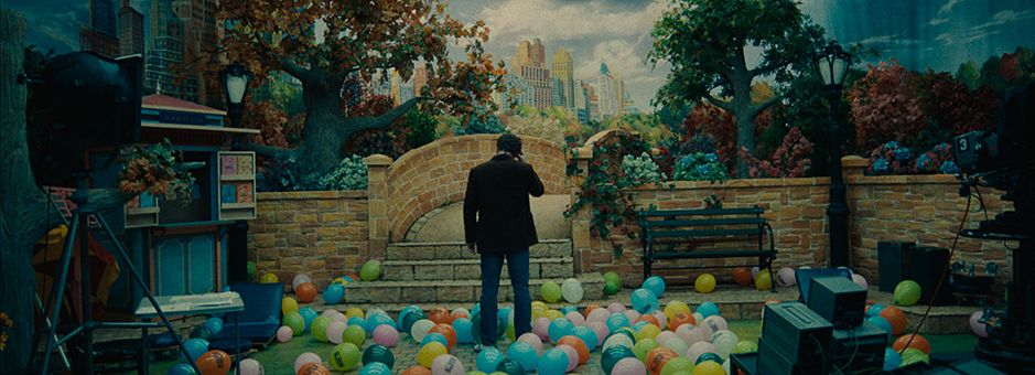
Eric is a 2024 drama series from Netflix, starring Benedict Cumberbatch. It follows the life of a grief-stricken puppeteer and father (Vincent) after his son (Edgar) goes missing and how he finds solace through his friendship with Eric, the monster that lives under Edgar's bed.
The series, directed by Lucy Forbes, has garnered significant attention not only for its compelling narrative and character development but also for its exceptional colour grading and cinematography – shot by cinematographer Benedict Spence and graded on Baselight by senior colourist and founder of Harbor’s CHEAT in the UK, Toby Tomkins.
Getting started
The project landed with cinematographer Benedict Spence when he got a call from director and long-term collaborator, Lucy Forbes.
“Lucy said, there’s a script coming from Sister Pictures, written by Abi Morgan,” says Spence. “Abi Morgan wrote Shame (2011) and The Iron Lady (2011) and has won numerous awards for her work, so I jumped at the chance to be involved. She explained how the series is set in 1980s New York, which I was excited about. And then she added, ‘it’s about a puppeteer whose son goes missing and whose life descends into a spiral of madness, and there’s a 7-foot puppet monster in it, too.”
Spence has worked with colourist Toby Tomkins in the past, so when he and Forbes got on to discussing the grade, he quickly put his name forward.
“I’ve always wanted to work on an ‘80s New York project, so the brief was a dream come true for me,” says Tomkins. “It was great to be involved in discussions from the beginning and I was able to work with Spence, Forbes and the show producer, Holly Pullinger, to build a show LUT before filming even started.”
Test shoot
Being familiar with ARRI ALEXA, Spence didn’t feel the need to spend too much time testing cameras and lenses, but he did feel it was important to do a screen test.
“It’s something I do religiously and find it’s a great way to get to meet everybody and create some confidence and excitement,” says Spence. “We got to do a perfect lighting setup, shoot all our key cast and take footage to Toby Tomkins, who made it look amazing. And then we got to show everybody this amazing footage of the cast, sets and costumes. This is all the week before shooting, so it eases those last-minute nerves and deflates that ‘bubble’ of stress and suddenly everyone's confident and excited.
“And it also meant that Toby got some actual footage to work with and start playing with colour and grain, which the team can see and get on board with before we shoot. It is always worth doing.”
Creating a LUT
“The test shoot also supported the LUT process,” says Tomkins. “Having this test footage means I can create something that's bold and strong because I know it'll work for the scenarios of the show. It means I can get closer to the look sooner.”
“Look development is one of my favourite parts of the job,” continues Tomkins. “It’s great to get beautifully lit screen tests and have time to explore. It makes finishing a lot smoother.
“I love building the look, dialing the halation and finding those moments of discovery. You get this a little bit per scene when you get to the DI, but finding the look and creating a world is really rewarding and you usually know when you’ve found it. It’s different for every job because it depends on the material, cast, production design, lighting, costume, makeup. The perfect look for one thing will never be the perfect look for something else. It might look similar from afar, but when you examine them closely, they're all slightly different, like snowflakes.”
Film emulation
“A lot of the visual references we provided, if not all, were shot on film – but we didn’t actually shoot on film,” says Spence. “Who needs film when you have Toby Tomkins? He did such a great job at emulating this look.”
Spence shot on a pair of ARRI ALEXA 35s, which Tomkins said, “gave us the best possible starting point for a film emulation.”
“It’s amazing how you can take an incredibly high-tech camera which has 16 plus stops of dynamic range on rears,” adds Spence. “And then clip all the whites, crush all the blacks and end up with about five stops of actual dynamic range by the time Toby's finished with it. But, you know, at least it's there. It's good to know it's there.”
Part of this film look came from the detailed texture work Tomkins did in Baselight.
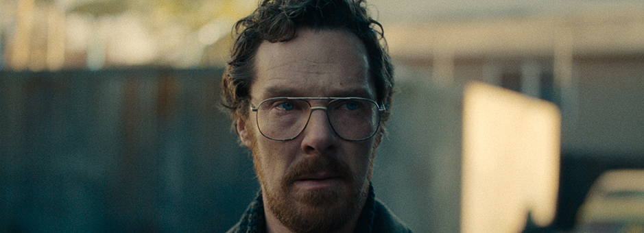
“We utilised the Texture Equaliser, Texture Highlight and a Halation stack in combination with the Add Grain operator to give the show its distinct texture,” says Tomkins.
Creating the look of ‘80s New York
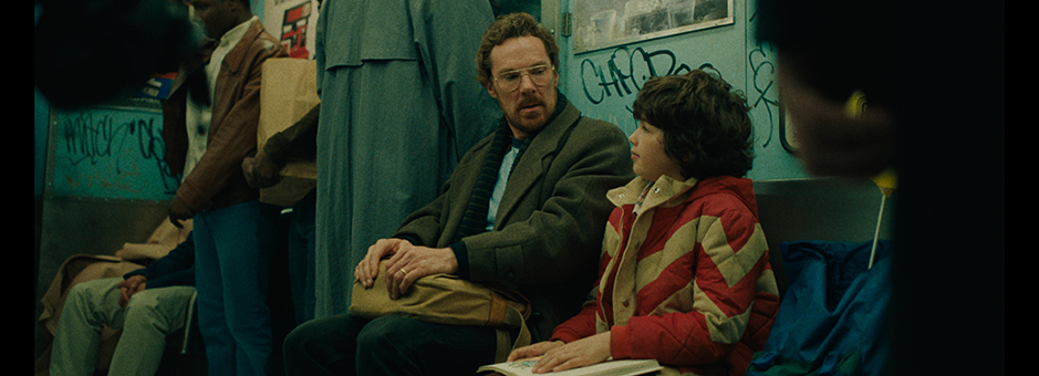
The series is set across multiple locations, from domestic environments, apartments, offices, police stations, clubs, undergrounds and subway-based homeless villages. Spence, Forbes and Tomkins had a clear vision of creating the gritty reality of New York in the ‘80s.
The team looked to a selection of reference images and stills for inspiration.
“I remember one was a shot of the subway train with the balloons, which encapsulated the feeling of Eric – I think it was a photo from the eighties in the New York subway,” recalls Tomkins. “It was very much about the gritty reality of New York then and striking a balance of something that felt of the time but didn’t feel like it was captured at the time.”
“Technology has progressed so much since the ‘80s, and we wanted the series to have the impression of this decade without making it look like it was too outdated,” says Spence. “We wanted the ‘80s feel, but for it to still feel modern. To achieve this, we needed the lighting and camerawork of a modern TV show and to allow the colour to bring the feel of the past.”
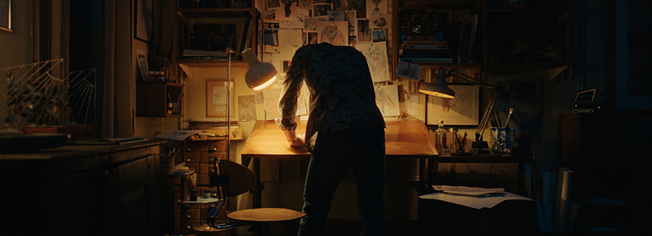
“I always try and make a show visually interesting,” says Spence. “I really try and push the different colours at the different locations and for each character. It has to be a believable space. For example, we applied a tungsten wash to the family’s New York apartment, so it feels warm with lots of browns, oranges and also with the lighting and depth. Which we carry through to the grade.
“The police station has lots of overhead fluorescents, which are much greener and cooler. Then there’s the main character’s father, Robert Anderson, who is a multimillionaire property developer living in a giant apartment with great high ceilings. We researched this and discovered energy saving light bulbs had just been invented, so used this look with a horrible daylight green spike to create a look for this cold location and character, which supported the narrative well.”
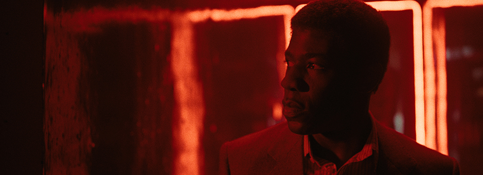
“This then went to the grade where Toby would develop and finesse the looks further – making it look even more fantastic and beautiful. He’d add depth, contrast and contrasting colours to make it real and help these different looks really shine.”
Tomkins and Spence worked closely with the team to get the look on episode one and from there they were left to work on the rest of the grade independently.
“I really just sort of pushed Benedict’s creations further forward,” says Tomkins. “There wasn't anything we radically changed in the grade, it was just about leaning into the look and adding a little bit of extra colour separation here and there. I’d look at what Benedict had done and what the scene had and find the sweet spot – finding the authentic beauty of what was captured.”
Eric was Tomkins’ first project graded on Baselight.
“It was a steep learning curve, but once I adapted to the FilmLight way of thinking, it really started to flow,” says Tomkins. “I loved using Base Grade for my overall primary balance and Texture Highlight was fantastic.”
“As we had the continuation of the LUT throughout the shoot and the offline, it meant we were able to push things a little more in the DI, because we had already created a base,” adds Tomkins. “With a LUT, there is often less resistance from people that are more sensitive to change, as they've seen it in the edit for months,” comments Tomkins. “It worked well and was quite a smooth journey – I had a lot of trust and respect from the team.”
“There was one moment where we had a little back and forth about grain structure”, says Spence. “But apart from that, it seemed to sail through, and everyone seemed to really like what we were doing.
“As Toby says, we laid our cards out early and we went along that path together – the execs, writers, showrunners, and everyone else was on that same journey with us as we were shooting.”
“It was very much about the gritty reality of New York then and striking a balance of something that felt of the time but didn’t feel like it was captured at the time.”


