Case Studies
Love, Death + Robots (Volume 2)
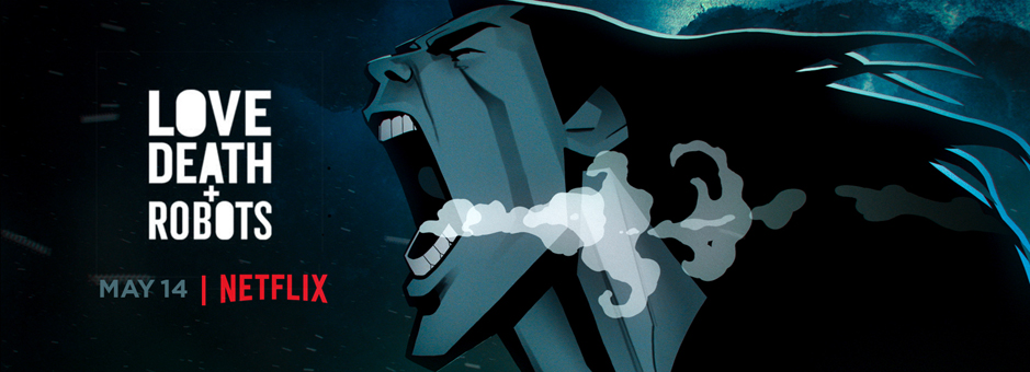
Love, Death + Robots is a five-time Emmy-winning animation anthology series produced by Blur Studio.
Launched in March of 2019 on Netflix, Love, Death + Robots delivers a variety of styles and stories, spanning the genres of science fiction, fantasy, comedy, horror and more. Created by Tim Miller with David Fincher as executive producer, the series brings together a global team of directors and animation studios to push and expand the medium.
Now the show is back with a premiere for season 2 on May 14. Senior Colourist Doug Delaney at Picture Shop is behind the look and feel of both seasons.
What brought you onto this project?
I had worked with Blur on season 1 and really enjoyed working with them. And I think they appreciated what I brought to the project in terms of my technical background, as well as creative input vis-à-vis finishing the various animation pieces and integrating the HDR choices we made.
The next installments are being called volume 2 and volume 3.
The episodes were done by a global animation community from all over the world; what was the workflow and collaborative work like?
Blur Studio is overseeing all of the projects, so they are responsible for managing the workflow of each of the animation facilities. That said, I worked closely with Blur to refine that process by taking what we learned from season 1 and improving the workflow. In an effort to unify all of the incoming colour pipelines from the various facilities, it was decided that we work in ACES for the finish. So elements were delivered to us in AP0 as EXRs with embedded mattes.
Jerome Denjean of Blur is the visual effects supervisor for the project. Jerome would imagine any creative notes with the episode directors in terms of colour and mood and come up with contact sheets that could be shared with the filmmakers. These contact sheets would be the jumping off point for look development and we would refine from there.
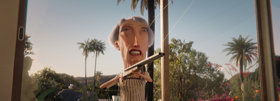
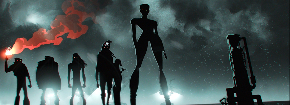
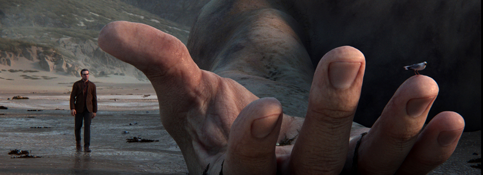
Each episode has a different narrative and style. Did you create a unique look for each episode or did you follow a consistent grade across the eight episodes?
Each episode had a different approach for sure, and really depended on what we all thought the episode required in terms of refining the finish. Some of the episodes were delivered looking very close to the final grade, and so we simply sweetened the look and massaged for HDR. With other episodes, we leveraged the provided mattes to relight scenes and balance foregrounds/backgrounds for continuity.
How long did you spend on the grade?
Total grade time was about 16 hours per episode, on average. Some were longer, others shorter. As it was a Netflix delivery, we graded in HDR with an SDR derived trim.
Why did you decide that Baselight was best to handle this project?
Why would I not? :) We’re working in a colour-managed pipeline, and no system does that better than Baselight. I also knew that we would need to be getting deep into using the embedded mattes to manipulate the composites. I was combining various mattes and shapes to get the selections I needed, and Baselight does that in an elegant and powerful way.
Can you tell us what brief you received, and who was sitting in the grading suite with you?
During Covid we were working entirely remotely using TecStream, which is our remote grading platform. And since the animation filmmakers are located all over the world, it was a perfect solution to be able to run the sessions as if we were co-located. The afore-mentioned contact sheets from Jerome Denjean aided in getting everyone on the same path to finishing during the first session. After working through notes and comments from everyone, I would do a pass on the piece unsupervised. Jerome and I would then work on the finishing touches and do a final approval session.
Which Baselight tools did you use the most and why?
Base Grade, Texture Highlight, and Matte Merge.
Base Grade helped tremendously when I needed to contour the highlights for HDR, or flare the low end a touch.
Texture Highlight was used to take the edge off specular highlights. Sometimes rendered peaks can be a bit hard, so subtly rounding them off can help.
And finally Matte Merge was used extensively to manipulate multiple embedded mattes and shapes.
The work is rich in textures, details and techniques. What has been the most challenging part of the project?
The most challenging part of this project has been adapting to each of the many styles of animation in each piece. There are, of course, technical challenges in terms of how we approach the grade and the HDR/SDR aesthetic. With animation in particular, the colour and contrast and quality of the images are each very specific. And honouring that in the multiple viewing spaces can be a complicated negotiation.
What’s next for you?
Of course, volume 3 will be coming up soon. I’m now grading Black Monday season 3 for Showtime, and I’ll soon be starting Inventing Anna for Shondaland/Netflix as well as Monster: The Jeffery Dahmer Story for Ryan Murphy/Netflix.
“Each episode had a different approach for sure, and really depended on what we all thought the episode required in terms of refining the finish.”
Download
Love, Death + Robots Case Study (PDF)


