Case Studies
Grading ‘On the Rocks’, Sofia Coppola’s love letter to New York City
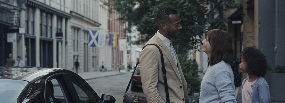
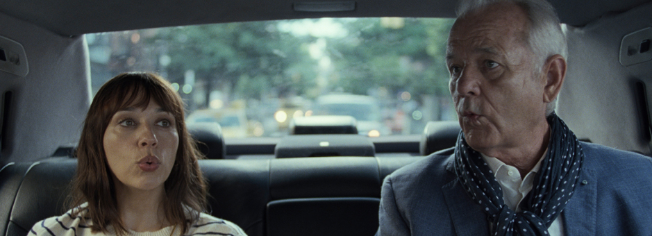
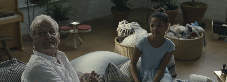
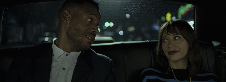
On the Rocks is an elegant generational-clash comedy, where a young New York mother (Rashida Jones) tails her husband along with her larger-than-life playboy father (Bill Murray). An exploration of identities in crisis, through the streets of the Big Apple.
Acclaimed filmmaker Sofia Coppola teamed up once again with DoP Philippe Le Sourd and colourist Damien Van Der Cruyssen (The Mill NY) for the images.
Can you share your experience over the years in collaborating with Director Sofia Coppola and with DoP Philippe Le Sourd?
I’ve been working with Philippe for many years now, especially after he relocated to NYC. He introduced me to Sofia first for commercials (such as Calvin Klein, Chanel, Cartier), then the opera “La Traviata” for European broadcast, and now two features, The Beguiled and On the Rocks.
I’ve always been a big admirer of both their work and careers and was thrilled to collaborate with them once they started working together. I recall La Traviata was a big challenge to shoot live, with multiple cameras, audience, complicated limited lighting conditions, and they mastered it so elegantly: this was a great rehearsal before grading The Beguiled together.
At what point did you get involved with On the Rocks?
On the Rocks was the second feature film we’ve worked on together with Philippe. Since the movie was shot in NYC, I was involved very early on. I screened all the camera tests and built a show LUT for Philippe, and also supervised all the dailies that were done at Technicolor PostWorks New York. We kept the LUT for the final DI, with slight modifications.
During production, Philippe and I both used the Copra app on an iPad Pro, an app specifically modified for this project, to allow CDL values to be applied before the LUT. We were receiving flat log scans from PostWorks every day synced through the dailies app and I would send an initial look to Philippe that he could comment on or modify directly.
Once our little back and forth was over during the day, we would send our stills and CDL values to the dailies colourist who would then match all takes to these references at night. It was a great way for us to try things before signing off on the look for each scene. It helped a lot towards the end of the shoot, when Philippe was in Mexico and I was in France and yet we were both still exchanging stills and CDLs with the dailies operator every day in NYC. Supervising dailies helps with getting to know the material in detail and better preparing for the challenging scenes, well ahead the final DI.
On the Rocks is a love letter to New York – what references did Sofia and Philippe give you?
Sofia trusts Philippe with all the look and technical aspects of colour and photography. They have enough pre-production meetings and decisions taken during production, so all is pretty clear by the time they go in final colour. She has a sharp eye and will always spot any flaw, so usually Philippe likes to present her something almost finished before her eyes.
Philippe had some references for the night scenes, but was also mostly interested in taking a new direction, since the lighting in the NYC streets has recently changed from Sodium vapor or Mercury vapor to LED, there wasn’t any reference that he wanted us to follow. For the night interiors, Philippe had one reference that he shared with me during pre-production, It was a picture from the Truman Capote Black and White Ball. it wasn’t a reference to stick to, but something that had both a very clean look, yet filmic and represented New York. Of course, the movie is set in modern day New York, but some locations in the movie evoke this era because that is where Felix (Bill Murray’s character) has lived and spent his time. Another influence and reference for the movie was Birth by Jonathan Glazer. I think Philippe particularly liked the sublime photography of this movie shot by Harris Savides and the way New York City was shown.
How did you create the look on Baselight?
Philippe wanted something elegant and filmic and nothing that would look overly processed, or unnaturally skewed. During the tests, I started building a LUT that had a slight print emulation, but kept the beauty of film rather intact. There is a subtle warmth in the highlights but nothing too saturated.
I usually use Film Grade and Curves to build my LUTs, blending in a little bit of a print emulation to restrict the colour palette a little bit. Lately I’ve been using the Looks function to create my show LUTs – it works very well with DRTs and does not create odd artifacts that you can have with some LUTs.
Other than that, I also use some Hue Angles and skin tone keys. For the HDR pass, I often use the Base Grade to adjust shadow details and highlight roll off, to keep it in check, and avoid it looking out of its world.
On the Rocks was shot in 35mm. Can you tell us more about it in relation to your grade?
What I love about film is that I always feel that the contrast and texture feel right, from the beginning. The show LUT we used was very gentle and not pushing a look in any way. We went for something not too saturated, a bit silvery, but I don’t think we used any tricks that couldn’t have been done in a photochemical process. That being said, I used the Film Grade as printer lights for my first pass. After a few days we started finessing the grade and I added some subtle windows.
There are many night scenes during the film; how did you approach them?
That was the most difficult decision to make for Philippe. During pre-production we even tested some digital capture to compare and see if that could be a solution. In retrospect, I think it was more to reinforce his pro-film direction. Philippe wanted something that would not feel lit but also really wanted to keep the movie very consistent between day-time and night-time scenes. So, he wasn’t inclined to shoot those scenes digitally, and the rest on film. After screening the tests, we felt that the pulled process looked better than digital and he had just enough lights in the streets of New York to shoot as it is, with little to no relighting in the background.
How much time did you spend on the grade and deliverables?
We did the main grade for theatrical release in P3 over two weeks and then switched to the Dolby Vision mastering at the end for three days, producing an HDR and SDR master.
What was the most challenging part of the project?
We always had this constant effort of grading an “elegant comedy”. Sofia and Philippe both wanted to keep an aesthetic that fits in Sofia’s sophisticated filmography. We were really riding that line of not looking too dull, nor too bright & vibrant. The movie is a comedy but there is a definite element of personal drama lived by the main character, so I think that’s where the more subdued palette comes into play.
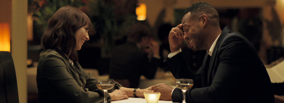
One challenging part of the project was how to integrate the few “out of NYC scenes” into the movie: having a slight distinctive palette, yet making a coherent and fluid continuity. It's always difficult to switch from one environment, to another, yet in the same story. The Mexican part is of course warmer and brighter, to make a bit of a jump, to feel like an adventure inside the movie, visually too.
What part did you enjoy grading the most?
I always love grading with Philippe because he embraces the underexposed look, but keeping it soft and beautiful. The Beguiled was already such an extraordinary grading experience for me, as it was shot so boldly, yet subtle in the lower lights. He always pushes for a more filmic and subdued palette, but never lets it look too forced or stepped on. So, it's a delicate and precise grade.
The chase scene was probably the most fun to grade, it had a lot of shots to match, cutting from different angles and having different city lights in the background.
“We had this constant effort of grading an ‘elegant comedy’. Sofia and Philippe both wanted to keep an aesthetic that fits in Sofia’s sophisticated filmography. We were really riding that line of not looking too dull, nor too bright & vibrant.”
Download