Meet The Colourist
Anthony Raffaele
Senior Colourist, Technicolor PostWorks NY
Anthony Raffaele began his career with Nice Shoes in 2001 and joined Deluxe in 2009. Now at Technicolor PostWorks, Anthony is one of the most sought-after colourists in the city, recently working with the legendary cinematographer Vittorio Storaro on the latest Woody Allen film, Café Society.
Here Anthony talks about how his life has been transformed by grading on Baselight and what an amazing experience it was to work with Vittorio…
How did you start out in post and become a colourist? Was it luck or a ready mapped out plan?
After graduating from film school, I ended up working in the shipping department of New York post house Nice Shoes, which had a very good training program. During my eight years there, I learned everything I could about video, film and post-production. I started my journey from shipping to colourist, doing everything from cleaning 35mm film to assisting commercial colourists. At that time I primarily graded commercials and music videos, all working at night.
When I started, we were primarily working with film on Spirit telecines, then switched to non-linear colour correction and finally to Baselight. I moved to Deluxe New York for the next six years, where the opportunity arose to grade Blue Bloods, a big CBS show. I had a chance to do a couple of feature films as well, working with cinematographers such as Rachel Morrison, Igor Martinovic, and Dean Cundey.
I moved to Technicolor PostWorks New York in 2014. One of the draws of coming here was that they support Baselight, so I jumped at the opportunity.
How did you get to work with Vittorio Storaro?
I met Vittorio Storaro when we were testing the F65 camera in 4K projection at Technicolor PostWorks. I ended up colouring both the dailies and the final for Café Society. I consider it a huge honour and a lifetime opportunity to work with him.
Vittorio was like a teacher, talking about the art, about inspiration and where to find it. Everything from how to frame a picture to why colour temperatures are important. You learn a new perspective from someone who is a master of his art, but is also fun to work with. His team is fantastic too – Will Arnott, the cameraman and the DIT Simone d'Arcangelo, among others. Café Society was a very collaborative way of working and fun: you might think that artists of this calibre would be more stressful to work with but it was quite the opposite.
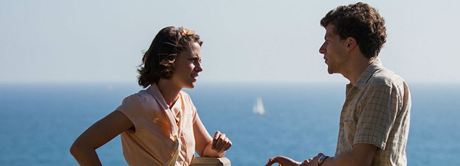
Tell us more about your experience in grading Woody Allen’s movie.
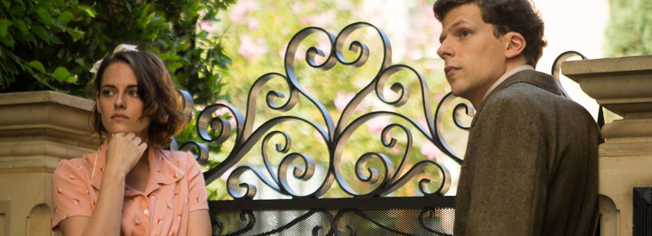
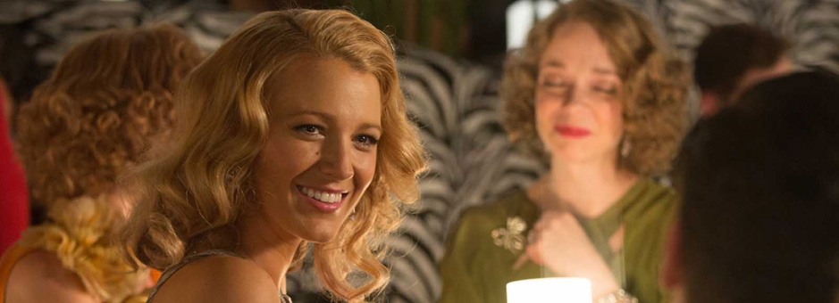
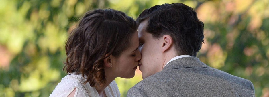
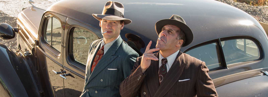
Amazingly, Café Society is Woody Allen’s first digital feature film as director. Set in the 1930s, it follows young Bobby Dorfman (played by Jesse Eisenberg) from his humble origins in the Bronx to the glitz and glamour of working in Hollywood. After getting his heart broken in California, Bobby returns to New York and finds his calling running a nightclub. The film is beautifully shot by Vittorio. We created several looks that reflected the major locations, each requiring a distinctive visual style.
From his previous experience using Baselight in Europe, Vittorio was insistent that it was the ideal tool for both the dailies and DI. I was delighted that he wanted the same colourist for the dailies and finishing, a preference he developed working for so many years with the master lab timer Ernesto Novelli at Technicolor in Rome. Working with Vittorio this way proved to be one of the greatest opportunities I’ve ever had.
The technical aspects of the process were also uncompromising. Because we worked entirely in the Baselight colour spaces and ACES from dailies through to the final, we never hunted for our looks, we just refined them in harmony with the film as it evolved. We also conformed the picture in Baselight – this was a first for us, and allowed direct manipulation of the original camera media where required.
Other than Café Society, what projects have you been working on recently?
I am currently grading three TV shows, all half-hour comedies: The Jim Gaffigan Show, Difficult People and Odd Mom Out. I also have Younger starting at the end of summer. They all have their own look and their own style but none are technically or emotionally heavy. We’re not colouring in ACES or outputting in 4K; they’re mainly HD shows. They’re all light-hearted too, which is nice because you want to laugh for a while between heavy dramas or feature films!
You have worked on the film side and also graded commercials and TV programmes. How do they differ?
The biggest learning curve was going from commercials to TV as you are undoing tendencies to catch peoples’ eye, to create vivid, strong images all the time.
Grading features, you create a palette that is more soothing to the eye, so the contrast and saturation are different. It is like learning a different part of your craft, a different language.
With film you often have considerably more time to fine-tune the grade, while in TV the turnaround time is much shorter, so you are more likely to make broader, strategic adjustments to the overall look.
How would you define your personal style of grading?
It’s certainly ideal to plan the look in advance as with Café Society, but often the clients come in the day of their session with the cut and only then discuss the look of the film. In that sense, my style is to “be as collaborative as I can be,” to listen and keep my eyes open.
It’s not that I don’t have a style; the style is the project I’m working on, collaborating with the cinematographer and creatives to craft a look that suits their story.
Tell us about your DI suite and Baselight set-up? How does it fit into your workflow?
We will conform on Baselight or on another system like Flame or even Avid depending on the technical requirements of the project. If I want to work off raw files, we can conform on Baselight as it’s the most flexible way to get grading and VFX dropped in as needed from other facilities.
For features, I’ve been using a 4K Barco digital cinema projector, so I prefer to grade to XYZ as I feel that is how your DCP is being made – what you see is what you get in colour correction at that point. We also make the DI deliverables in Baselight. Titling is done outside then brought into Baselight so when clients review we can adjust the colour behind the titles, darken the title itself, and so on.
For TV shows we often use a Baselight for Avid-Baselight workflow, so shows are conformed on an Avid, the online editor passes an AAF back to me. I colour and then return the AAF with colour, so it’s nearly renderless. This is usually done on a fixed display in a normal TV suite, where the colourist is sitting up close to the screen.
We also use consumer 4K displays as well, as a kind of gut-check.
What do you like most about Baselight?
The best part about Baselight is that there is no clear-cut way to do one thing; there’s a lot of depth to the creativity. It lets me be as expressive as I want to be, using different tools to get really great results. The sky is the limit: as long as I come up with the idea, there’s always a way I can do it in Baselight.
The keying is really fantastic, and the matte tools for keys and windows are really great. It makes it easy to do very strong grades inside keys and windows and feather them off so the work is not distracting, it becomes part of the lighting.
You can create one correction on Layer One and create a different correction on Layer Two, which both look great, but if you flip layer two to one, it changes and creates a different density, a different look. It’s that interaction between layers that is really fantastic about Baselight. It is much more intuitive and has a huge range of tools.
And there is no other system that does colour space workflows like Baselight – or is up to par with Baselight!
On Café Society we did the full DI projected in X’Y’Z’. When we came into the room to do a Rec.709 trim for television, we put the BT.1886 display transform on and I think we put half a point of red throughout the entire show, which was essentially the only adjustment. We then did a transform to PQ for HDR and again it very much looked the way we expected it to. We then did some tricks on top of that to take advantage of the HDR contrast range but we were able to start at a place that looked comfortably like the HD grade, only with more range around it – that sort of colour management is really unsurpassed. It’s fantastic!
That is huge for me because I can with confidence say to my client that this is what it will look like from the DI, to Rec.709, to HDR, to a QuickTime file on your laptop. You can go from one room to another, and the client has faith that the decisions they are making will transfer to another display format.
How does Baselight help with your productivity and creativity?
Baselight gives me the flexibility and tools to be as creative as I need to be. Clients notice that I am able to translate what they are asking for with ease in Baselight. They also appreciate the speed of using the Blackboard panel. The layout of the Blackboard helps: it is very intuitive with keys set in really good spots.
I have worked on other systems where clients asked what it would look like with a more diffused look – like a classic soft filter – or with an added grain look. It’s easy to do on a Baselight, but it really isn’t on other systems.
On the flip side, clients can ask to do something super highly saturated, with very specific colours. With the matte tools in Baselight I can pop specific things without rotoscoping the whole film. The qualifiers are unsurpassed.
Apart from Café Society, what is the collaboration usually like between you, the director and DoP?
It’s like anything, the person that you’re working with defines the approach. Clients often come to you for something specific and have expectations. They have the ideas and story, so how much or how little they want my involvement is really determined by them. The first thing I like to do is ask them what their film is about – give me the one sentence that encapsulates the whole story. From there I can structure my input, such as how to work with the emotions in the scenes.
This is where the collaboration starts. We discuss what they want to do and how they want to work. This helps me know how to use the tools I have, whether that’s a general look, or creating shape in the film by windowing, keying, or diffusing to really emphasise certain parts.
In your opinion, what is the role of a colourist today and how has this changed over the years?
The role of the colourist has grown, particularly in feature films where we are getting pulled in earlier and earlier in the process.
With systems like Baselight, you have the tools to restore scenes that clients might be worried about. Being able to do what the client wants means they come back with ideas and bounce them off you. For example, on Café Society, Vittorio wanted a candlelit scene and we spoke about how much we could do before the shoot, how to take care of noise, all as a collaborative team. Getting the colourist involved early has the clients doing more: you could say they are there to steer the boat while we are there to make sure the engine is right and running correctly.
Any advice to someone looking to start a career as a colourist?
Go into finance!
Seriously, if you are creative then I would recommend that you find a place where you feel you can get the opportunity to follow your instincts. Learn about art history and photography! I’m always looking for inspiration to come up with a look. Clients may reference a specific era in history, so you can look into the photography or art of that era to get a basis for what they are looking for and draw inspiration.
So what do you like to do after you have been in a darkened room all day?
I live by the beach, so I try to get out in the water, hang out on the beach, get a bit of sun, and enjoy nature. There’s something beautiful about not living in a big city, being out on the ocean and allowing yourself to relax. You can’t take your cell phone into the water, so you can escape for a little while.
It would have to be Casablanca. Something about how well the witty dialogue holds up. Also Bogart’s performance is amazing. It is a classic film that I can watch over and over again. On the flip side, I grew up watching Jaws as a child.
If you could have graded any movie in your lifetime, what would it be?
I would have loved to have graded The Matrix. It’s one of the most iconic-looking films of my generation, and there’s just something really special about it. It was all photochemical, and I know they put a lot of time into how they timed and processed that film.
Over the years I have worked with some great people. In fact every colourist that I’ve worked with has inspired me in one way or another. Each one of them had something special about the way they work. All the colourists I have had the pleasure of working with have helped to make me better at what I do.
Woody has a film starting production shortly…
Join In
If you want to participate in our MTC programme, we'd love to hear from you. Contact:
Alexa Maza
e: [email protected]

“It’s a huge honour and a lifetime opportunity to work with Vittorio Storaro. He was like a teacher, talking about the art, about inspiration and where to find it.”
Details
Colourist: Anthony Raffaele
Role: Senior Colourist
w: Technicolor Postworks NY