Meet The Colourist
Gene Curley
Colourist, Nice Shoes
New Yorker Gene Curley has collaborated with top creatives and directors to craft stylish spots for brands such as Estée Lauder, Prada, and Coach.
His eye for the elegant world of fashion and beauty is contrasted by a love of bowling shirts and cheap beer.
How did you make your start in colour?
In college I majored in communications, where I learned editing. I had an internship where I edited in Adobe Premiere for a CD-Rom Men’s Magazine called Trouble and Attitude, aka “T&A.” One project that I remember was when a producer had interviewed a bunch of adult film stars, and he gave me the footage to edit it. My task was to take a few additional clips and cut them into the interview footage. He told me to pick out the best – nothing too risqué – and at that point I really thought I wanted to do editing.
When I started at Nice Shoes, I still had every intention of pursuing a career as an editor. I didn’t really know about colour or the wider spectrum of post-production. Once I sat in some sessions, and realized what a colourist’s role was - such as creating the look of a spot - I fell in love with the art of colour grading. I then trained as an assistant and ultimately grew into my role as a colourist.
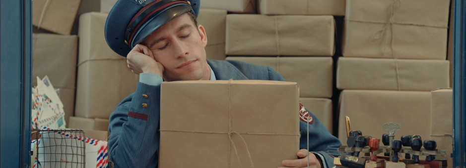
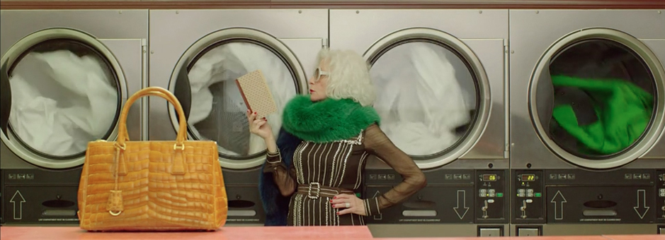
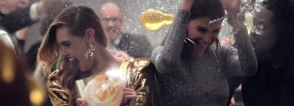
I like doing fashion and beauty work, as it tends to give you more range in creativity. There’s an art to traditional 30 second or 60 second commercials, but in fashion and beauty work they’re more like short films and the clients are open to pushing the look a bit more – going into a fantasy or surreal world. They’re willing to experiment rather than aiming for a lifestyle, real-world look.
We had one day to do five shorts. Baselight is an incredibly fast system, it enabled us to prep the job, work with our clients, and output all in one day. For a big, high profile campaign like that, I think that’s pretty impressive.
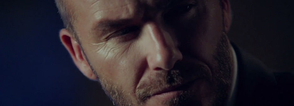
The director, Autumn de Wilde, had a very clear vision, which helped on such a short schedule. We received the material the day of and we were able to load everything up with the EDLs very quickly before our clients came in. We went through all five pieces and quickly compared the shorts to each other. We established a similar look, but with little variances in tone for each one. While everything was loading, we were able to switch between each piece to set a look before diving into the project as a whole so we could find out how the grade worked before tweaking it for each spot. For example, inside in the stairwell, we made it darker, moodier, sexier to reflect that piece in the series without departing entirely from the look we were creating.
* Honoured at the AICP Awards with a win in the Visual Style category.
Music videos are also a genre that give colourists a bit more creative freedom. While a tie-in to a Disney film, the director didn’t want to match the saturated look of the feature. We came up with a ‘low-fi’ direction, a colourful but muted look. It’s a fantasy look, but slightly more of a darker fantasy. The footage had a great starting point for us to build off of into achieving that goal. The muted colours gave us that darker fantasy world, but we added windows on Pink to make her pop a little more so she wouldn’t get lost against the environment of the video.
Is there any type of project you like most?
Fashion films. Music videos. As I said before, these really present opportunities for me to be creative with our clients. We’re mainly a commercial studio, usually a day of colour for each spot unless it’s part of a larger campaign. It’s fun to work on longer format projects such as music videos or short films, and to sit with things for awhile instead of the tight turnaround of a single day.
How would you define your personal style of grading?
I like to push things. It’s easy to fall into the style of correcting where you balance and make it look good for how it was shot, taking the footage where it wants to go. That’s a great skill to have, and necessary when implementing a director or creative’s specific vision. When it gets really fun for me is when they want to go away from that, and put more of a look on it. A recent example of that is an Oscar Meyer spot I did a little while back. It looked good how it was shot, but they decided they wanted to add a ‘Mad Max’ look to it. I love it when we can work together and really get creative in order to push it into a world that the footage wasn’t necessarily shot for.
It may vary from project to project, but how early do you get involved in a production?
Generally, the earliest I ever get involved is the bidding process, when I see storyboards in order to figure out scheduling. Sometimes there’s more involvement, often with regards to making sure the product works against all the colours in play during the shoot. For example, we might have test footage or a test still to work with, and the client will want to see how far we can push the colours of one type of car or product – how much they can adjust the image before they shoot, and what they need to consider on-set in order to best prepare for post.
We’re starting to learn Baselight for NUKE. When collaborating with our Creative Studio team of creative directors and VFX artists, we share material through the SAN, which makes things really easy. Baselight is quick and efficient at bringing their work in. They’ll export the material for us and in a short amount of time our assistants will have the material loaded in one of our colour suites and we’ll be able to start grading. Once the colour’s done, we’re also able to get them their materials back very quickly.
With each of our partners, we’ve tried to recreate the experience of working at Nice Shoes, but remotely.
Our monitors match the monitors in each room, with our engineers traveling to install and calibrate each monitor so that they match ours exactly. Clients are able to work with us in real time – we’re able to talk to each other as if we were all actually in the room through Google Chromebox for meetings.
My experience is pretty much the same. I’m able to do the same things as if the clients were actually here. We’re able to see each other through the Chromebox, so there’s still that personal face to face interaction with the clients. They’re right next to me – I can even see what they’re having for lunch – and we’re able to communicate and read each other very well. It’s really the full experience without actually being in a physical Nice Shoes room.
What do you like most about Baselight?
The intuitiveness of it. FilmLight has always listened to our thoughts and suggestions on how to tweak and improve the software, which is great. They listen to their clients and modify based on user feedback, which I think is really important.
What is it about Baselight that helps your creative process?
With Baselight, I’m able grade as quickly as I can think about it. The thing I really like about Baselight is the strip-based GUI for colour correction and layers of colour correction – I prefer that to the node-based GUIs of other programs. When I’m building a complex grade, I don’t really feel like I’m technically trying to make something work rather than creatively trying to make something work. Other node-based machines feel more technical, but the Baselight is just there; it’s all very fluid.
What advice would you give to people interested in becoming a colourist?
One of the most difficult things is finding your voice as a colourist. It’s easy to defer to your clients but having your own voice is always very important. If you feel like you’re doing what’s expected, but you have something you might like better, it’s important to remember that while you’re working with other people, ultimately the colour is up to you. You need to speak up and offer up a creative solution that will help them sell this product. You have to articulate what you want to create, and balance that with not being too overbearing or rude. Always do your version of what they want. That’s what makes you stand out as a colourist. Above all, enjoy it.
Join In
If you want to participate in our MTC programme, we'd love to hear from you. Contact:
Alexa Maza
e: [email protected]

“There’s an art to traditional 30 second or 60 second commercials, but in fashion and beauty work they’re more like short films and the clients are open to pushing the look a bit more.”
Details
Colourist: Gene Curley
Role: Colourist
w: Nice Shoes


