Meet The Colourist
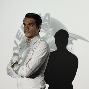
Glen Castinho
Head of DI and Senior Colourist, Alvernia Studios, Krakow
Glen Castinho, Head of DI and Senior Colourist at Poland’s Alvernia Studios, shares with us some highlights from his experience in locations across the world, including Poland, India, UK, USA and Germany. He explains why, for him, a colourist needs to combine art, science and engineering to best contribute to the collaboration with directors and DoPs.
How did you start out in post and become a colourist? Was it luck or a ready mapped-out plan?
It was just pure luck – combined with passion and curiosity.
I didn’t finish film school and I don’t come from an industry related to film, but growing up I was interested in animation so I studied computer arts and animation.
Films were a hobby, so I ventured out doing various other trades, from being a DJ to working in sales. But then I appeared in a documentary, John and Jane, directed by Ashim Ahluwalia.
This experience brought my attention back to film. Ashim encouraged me and helped me enter the post business with an Autodesk Smoke internship. Shortly after, the studio I was interning at had an opening for an assistant colourist on the telecine.
When I was introduced to the Spirit 2K and the Da Vinci 2K Plus, I enjoyed it so much that I made the shift. I started from embracing the tape room know-how, to prepping the grading sessions and assisting the senior colourist, to finally working on commercials myself. This period formed the foundation of my grading skills and also taught me the technical aspects of film to video transfer.You were a colourist but also a Baselight product specialist?
In 2005, I started to work with a FilmLight reseller in India. My task was to introduce Baselight to the clients, provide support and conduct demos along with training. I visited several facilities throughout the country while assisting installations and calibrations of Northlight, Baselight and Truelight. It was a valuable experience and it helped me gain a thorough insight into the DI process.
Over those years, thanks to the support of my colleagues combined with regular training and hands-on experience, I honed my skills in creative grading and the technical aspects of the trade.
When I moved to Europe in 2007 I helped set up two 4K DI suites. I worked as a DI consultant, trainer/demo artist and freelance colourist in different countries. Later I got involved in building the DI department at Alvernia Studios, the most modern post-production facility in Poland.I work on Baselight 4.4 on a Baselight EIGHT system and grade either from the Sony SRDX 4K projectors or on the HD Cinetal monitors, which are calibrated using the Truelight probes. The DI within the department is integrated with Northlight 2, Baselight EIGHT and Truelight colour management. The VFX department uses Autodesk Flame connected to the Truelight SDI box.
The setup has repeatedly proven itself in many different scenarios. I am very fond of the disciplined yet flexible reasoning that stands behind all the products.How would you describe your favourite style of work? How does it relate to your preferred toolset?
I love the organic texture of celluloid and regard 35/16mm film as an uncontested quality touchstone.
While working as a trainer and demo artist I was fortunate to meet and exchange ideas with colourists whose experience derived from the era of photochemical timing. I tried my best to interpret their requests to incorporate traditional lab timing into their new digital grading platform, to help them adjust to the technological changes. Their organic approach became a work paradigm for me too.
Baselight tools allow me to work with densities and channels as if I was colour-timing the negative in a traditional lab. The system gives me a wide space to experiment and bring the picture to a place that was inaccessible before due to technological restrictions, or to retrieve looks that would be impossible to achieve using traditional methods.
Even though the system gives endless possibilities I like to use the toolset efficiently and keep it simple. For me, grading is like sculpture. You cannot fight the image: instead you should read through it and reveal the best it has to offer. Baselight helps me seamlessly achieve the best results, as if it was literally integrated with my grading approach.How much importance do you give to the technical side of grading?
Being tech savvy adds to your artistic abilities. When you are aware of your limitations and know how to get the best starting point it actually opens up the creative possibilities, knowing you will maintain high image quality in all delivery formats.
For me, colour grading is an inextricable combination of art, science and engineering. These elements are crucial to best fulfil the expectations of directors and DoPs.
Technical skills strongly enhance your craft, especially nowadays when the rapidly changing digital formats create challenges that need to be tackled in order to concentrate on the creative part of the job.
It is quite important to be vigilant for the changes in the industry, and continually look ahead to enhance the DI pipeline with the latest solutions.So what do you like to do after you have been in a dark room all the day?
I relax, listen to electronic music and read about the history of space travel missions. I also spend time indulging my interest in analogue modular synthesizers.
What's the latest project you have been working on?
The latest feature I completed was Bhaag Milkha Bhaag. On behalf of Alvernia Studios, I collaborated with director Rakeysh Omprakash Mehra and DoP Binod Pradhan as the supervising digital colourist. The grading took place in EFX Prasad in Mumbai on the Baselight system. I was very happy to come home and work with one of India’s most respected and successful directors and such a talented cinematographer. It was a very creative experience. Each scene, each era of Milkha’s life had to be treated differently so that the viewer could be convincingly transported to that specific phase of his life. The film had a great reception: it became a super hit in India and was the sixth highest grossing Bollywood film worldwide in 2013; it also won the National Award and bagged a total of 13 awards (including nine technical prizes) at the IIFA held in Florida this April.
Any other interesting projects you’ve been involved in recently?
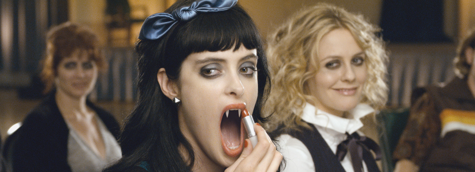
Before this, I worked on Miss Lovely, a film set in the criminal depths of Mumbai’s C-grade horror and porn film industry. It was an Indian production yet very different from the Bollywood mainstream. I worked together with director Ashim Ahluwalia as the DI consultant.
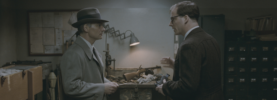
The feature was unique, not only for its controversial storyline and disregard of common expectations, but also because of the baffling narrative rhythm and experimental arthouse style, rarely seen on Indian screens. Before post-production we researched many styles and mainly drew on Japanese New Wave as the colour reference. I worked closely with the development team at FilmLight to achieve the desired look by emulating out-dated Fuji and Agfa stock from the ‘60s. The film was shot on Super 16 and 35mm and scanned on the Northlight.
The screening of Miss Lovely was met with high acclaim at several international film festivals, including Toronto and Rotterdam and was selected for Cannes in the Un Certain Regard section. It also won the National Film Award – Special Jury Award (Feature Film) and Best Production Design at the 61st National Film Awards.
Is there any difference in expectations towards the grade when you work in different countries?
I have worked with directors and DoPs from the US, India and different parts of Europe. In a way it is true that the commercial aesthetics are unified to a common standard, but luckily there is always an element of local peculiarity left – and that’s what is most interesting for me. This is in relation to the storyline, acting style and edit, as well as the grade. From my perspective I believe that colours flavour cultures.
This is not reduced only to the expectations towards skin tones, but also includes perception of what is correct in terms of light, contrast and the overall palette. The same emotions and moods can be expressed with totally different tonalities by filmmakers of different backgrounds. This might lead to interesting clashes and fusions in international teams.
As a colourist, I always try my best to observe the surroundings when I travel, how the light behaves in different climates, how the shadows fall, what the palette of the urban surroundings is in different regions. I believe that being aware of such nuances gives me a guide to better understand the picture once I’m in the grading suite.What films do you watch ‘off-duty’?
I enjoy classics of directors such as Fritz Lang, Pier Paolo Pasolini, Alejandro Jodorowsky, Satyajit Ray and early films from the Merchant Ivory Productions. For a change I choose either experimental documentaries or B-grade sci-fi movies from the ‘70s.

“For me, grading is like sculpture.
You cannot fight the image: instead you should read through it and reveal the best it has to offer.”
Details
Colourist: Glen Castinho
Role: Head of DI and Senior Colourist
Company: Alvernia Studios, Krakow
w: www.alvernia.com


