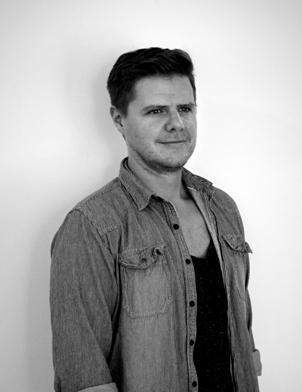
Meet The Colourist
Kyle Stroebel
Colourist, Refinery, Cape Town
Kyle Stroebel, colourist at Refinery in Cape Town, talks to FilmLight about how he used colour in his latest movie Flatland and how the barren landscape featured in this film provided his inspiration.
Kyle, who has a wealth of experience in grading a range of international projects from feature films to commercials, also shares what excites him about colour and how he got into the world of grading.
First, congratulations on your success with Flatland. How did you get involved with the movie?
Thank you. It is an incredible movie. The director, Jenna Bass, and I were in fact at film school together 12 years ago. I had graded her previous film High Fantasy, and that received a lot of critical acclaim.
Jenna had been working on this project for a few years and eventually, along with producer David Horler-Blankfield, they got funding for the film through a South Africa/Luxembourg co-production. The concept of the movie fascinated me and when Jenna initially asked if I would come on board it was a real privilege.
Can you tell us a little about the look of the movie, and how you created that look?
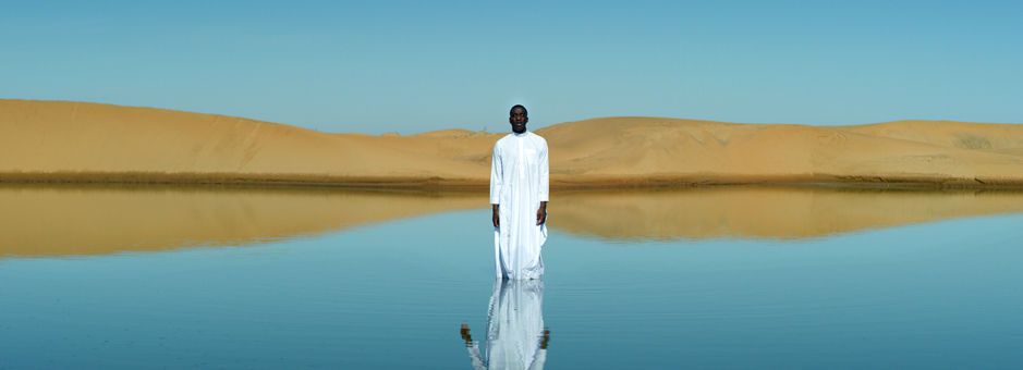
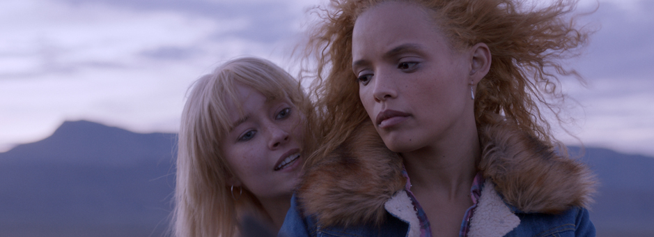
The film is set in the Karoo in South Africa, a particularly barren landscape that experiences extreme low temperatures but largely blue sunny skies. Jenna, along with cinematographer Sarah Cunningham, wanted to convey the unforgiving, harsh environment through the grade.
That part of the world has a uniquely South African feel, accompanied by odd spatterings of often kitsch colour tones. We went for a cooler feel that was accompanied by certain pops in these tones.
I tried to make the colour gentle, never forced, but also to have an almost grim tone. The story focuses on a hard journey two girls are forced to undertake, on the run from the law. The goal was to place the story in a vast, cruel environment, remote and often frosty, mimicking the plight of the girls.
One trick we used to provide a grittier element was to run variations of scanned 35mm grain through the film.
How did Baselight help you achieve the look? Were there any tools that were particularly useful?
What I really enjoy about Baselight is there are just limitless ways you can achieve the look. I feel my control of the curve has such versatility from a variety of tools, that when dealing with the varying light tones of the Karoo, we always had control over the smallest elements.
I often use the HueAngle key to soften overly bright areas and drop parts of the frame. Flatland was also my first feature on Baselight version 5, and I discovered the Texture Equaliser. When playing with softer contrast it often gives my image “grip” in any area I want, but also, when reversing the effect it helps soften harsher bits of the image. This combined with the seamless tracker allowed me to almost immediately implement what Jenna and I wanted.
What was the workflow on Flatland?
The film was shot on ARRI Mini in 3.2K ProRes. I was able to provide BLG files to our VFX department in order for them to access the look of the freezing Karoo outback as it developed in the Baselight cinema.
Our DoP, Sarah, was in London. We created DCPs for her to view at Technicolor, and she would narrate long voice notes with which Jenna and I would tackle the next day. Luckily at Refinery we operate as a co-operative unit so we had control over the to and fro of EXRs to VFX, which we could review immediately in Baselight in our cinema suite.
How would you describe the film industry in South Africa?
The film industry is largely split into two parts. There is service work for international clients that want our great crew, beautiful locations and favourable exchange rate. Historically they take their material back to finish in their home country.
And then there are the local guys, in conjunction with an increasing bunch of international clients that stay after their shoot and finish their work in South Africa.
Cape Town in particular has become loved as a destination and the post-production element is starting to be taken seriously. This week alone I have graded work for England, America, Japan and Italy. South Africa offers high-end international quality at a fraction of the cost of other emerging markets.
Our industry is now in a really good place. Cape Town experienced a devastating drought last year but our summer season this year has been very fruitful. We are seeing a big influx of long form material being produced and finished here. And we have a commercials industry that has been the bread and butter for many years.
I started out in telecine about 11 years ago doing one lights and rushes for a company called Condor. I worked for a variety of different companies battling with various models that struggled to come to terms with the (at the time) death of film and the shifting landscape of the post-production industry. Largely they were modelled around the lab and everything grew from that.
Two of the major post houses, Searle Street Post and Waterfront Film Studios, merged three years ago, and Refinery Cape Town was born. The direction of both companies was geared around a high-end digital workflow, and the move made sense.
Today we are the largest end-to-end facility in Cape Town. We offer a 4K DCI-spec cinema with two Baselight systems, and have finished our first HDR feature. We are also doing some incredible work in our VFX department.
When did you know you wanted to be a colourist?
I can remember the exact day. It was June 2006. I was at film school and we had a session with a colourist as part of a 16mm project. I remember the detail down to the aroma in the suite. I couldn't believe how they were manipulating my images.
What have you been working on recently, and what type of production do you prefer to grade?
This year has been crazy so far. I’ve been busy with a feature for Warner Bros. for the past two weeks. In between sessions for that I have worked on a variety of commercials, from fashion to Russian chewing gum. This month I have done Burger King, Grolsch, Woolworths and a bunch of music videos (two of which were shot on film).
My producers are great and keep me busy with something new almost daily. Coming up soon we have some series for two American networks. I just count myself lucky that I really love my Baselight suite, because I won’t see much else (and I would really like to apologise to my girlfriend for this).
I don’t have a specific preference for the type of production. I love commercials because they provide instant gratification after a day’s grade and often have a high production value and can be treated as such in the grade. But I also love long form work that lends itself to nurturing the look and developing ideas over time. If it’s beautifully shot I leave the office smiling.
What was the first project you finished on Baselight, and what was the experience like?
I’ll be honest I would rather not say. I think I was so daunted in the beginning about the seemingly infinite ways to grade, that I over-engineered the finish. It was on a piece for a producer who knew it was my first time behind the Baselight wheels and encouraged me to try everything. And I did.
Today I have a much more polished understanding and chuckle to think how much I have developed as a colourist.
What are your favourite tools in Baselight?
The integrity of the colour workflow and ability to achieve any conceivable desired pipeline. I know that’s not a feature as such but it still blows my mind how versatile it is. We have built the facility around the Baselight systems and have learnt how to cater for the most bizarre client requests.
Other than that I love the Texture Equaliser, and the simplicity of Base Grade within the ACES workflow. And I do love the Hue Shift functionality for quick and easy subtle changes. I have also been using the Colour Cross Talk, which offers a very interesting approach to get different looks.
What is your favourite camera format to grade?
Depends on who is shooting it. I’ve had magnificent images from a DoP using an iPhone. Although ARRI Raw doesn’t really have a competitor, as a whole, does it?
I have recently done a couple of good 16mm jobs. It’s one of the few looks you can’t achieve digitally. There’s a beautiful nostalgia that I do love about the format.
If there’s a dark moody piece then I can find myself getting into that environment. But likewise I can get inspired to go bright and colourful if the image presents itself. I do love a darker heavier palette. I think it often helps show off the colourist’s finer skills.
I think the mark of a good colourist is that he or she can switch, between depending on the job, with consistency above all else.
Do you have a particular goal you want to accomplish in your career?
I’d love to work in the States for a bit. I think as South Africans we often think about it as a sacred filmic ground. We do big fantastic work down here, but our pool of colourists is very small. To work in an environment of multiple colourists sharing ideas and techniques really appeals to me.
Other than that, just to get a few more international campaigns under my belt. And then to direct post-intensive material. I often think how I can do some of the stuff I work on better. One day I need to shut up and actually do it!
Join In
If you want to participate in our MTC programme, we'd love to hear from you. Contact:
Alexa Maza
e: [email protected]
“I love commercials because they provide instant gratification after a day’s grade and often have a high production value. But I also love long form work that lends itself to nurturing the look and developing ideas over time.”
Details
Colourist: Kyle Stroebel
Role: Colourist
Web: Refinery, Cape Town