Meet The Colourist
Matthew Troughton
Head of Picture Post and Senior Colourist, Creativity Media, London
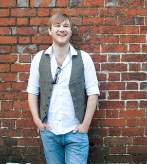
Matthew Troughton joined London post-house Creativity Media two years ago. He has shaped the look of a wide range of award-winning films including I Am Not A Witch, which won the 2018 BAFTA Award for Outstanding Debut by a British Writer, Director or Producer.
What brought you into colour grading?
I started out just as DI and digital grading was becoming a thing. At the time, I found that the people who knew how to wrangle the (often less than reliable) technical side of the machines also got the chance to get in and develop their creative side. I knew how to manipulate the buttons and cables, so I got to stand on the launch pad a lot quicker than I think I would today. That mix of creative and technical still hits the spot for me now, and means I never get bored.
When did you initially start using Baselight?
My initial adventures in grading were in the wild west of some of the early “new generation” systems: the likes of Final Touch (soon rebadged as Apple Color), Assimilate Scratch and a variety of other systems. The experiences were pretty tough; lots of crashes and limitations that you had to hide and mow through with clients sitting over you! Nonetheless, we got some great creative results out of the systems and began to get a following of producers and creatives.
At the time I realised that in order to scale up, both in terms of business volume and creative results, we had to get a grading system that was both rock solid in its reliability and support, as well as top class in its tools. With this, we could spend the maximum amount of time throwing colour on screen and not get stuck fiddling with buttons and filters. FilmLight’s Arthur Johnsen made it possible for a small post house to make the step up, and Baselight has been without doubt our benchmark for that all those years.
Be it grading at Creativity Media, Tech and Twickenham in London or Galaxy in Belgium, it’s Baselight that’s the gold standard I look for. It makes me sigh with relief when I see it sitting there.
Creativity Media is based in St. Katherine Docks near Tower Bridge in London, and is primarily focussed on indie feature drama and documentary. We offer full service post across picture, sound and delivery. Creativity Capital also provides finance services.
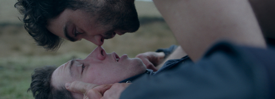
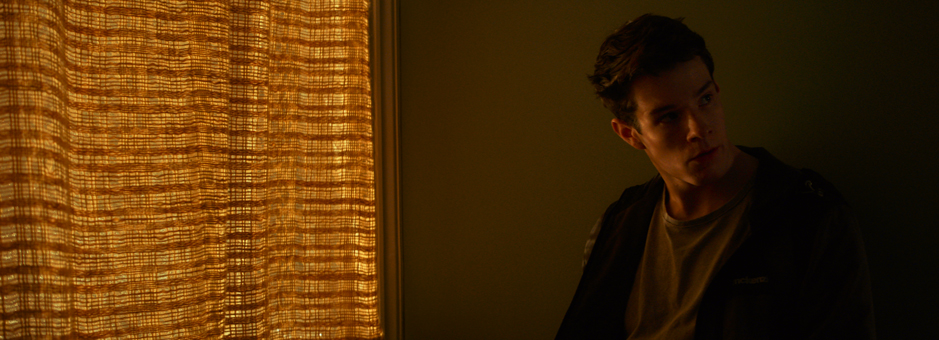
I’ve had the privilege to work on and provide grading services for a huge range of genres, styles and budgets, from the action and adventure of 47 Meters Down, Final Score and Stratton, through to some amazing award-winning drama such as I Am Not A Witch, God’s Own Country, and a recent favourite soon to be released, VS. (Versus). The company prides itself on not filling the facility with a litany of other work and focusses entirely on just a few films at a time, which allows everyone to really engage with projects in a way that I think is rare. It’s the total opposite of the sausage factory approach that sometimes appears, especially if budgets are tight. If we do it – we do it right. Last year we were the busiest film post-production house in the UK.
I work as the company’s Senior Colourist, but I also lead picture post as a whole as well as our technology strategy. It’s a big chunk of work but I find it hugely enjoyable blending the creative and technical work. In truth, more so now than ever, treating creativity and technology as one – with both driving each other – is critical to the future success of the industry.
I’m very strict about focus – when I’m grading, I’m grading. And it’s similar with the other hats I wear. This presents challenges as the world doesn’t stop outside the grading suite, but luckily we have an amazing team to make sure things run smoothly.
I find working at the coalface and collaborating with clients gives me a very immediate understanding of the creative desires and technical challenges that emerge on a day-to-day basis. As a result, we’re able to react rapidly to problems or engage with partners to enable creative ideas or needs. We are currently working on a fantastic Sony PS4 game where the Baselight support gang have been helping us to develop workflows and tweak various aspects of Baselight to get the results the developers want, both technically and creatively. It’s super useful to be in the middle of the fray myself.
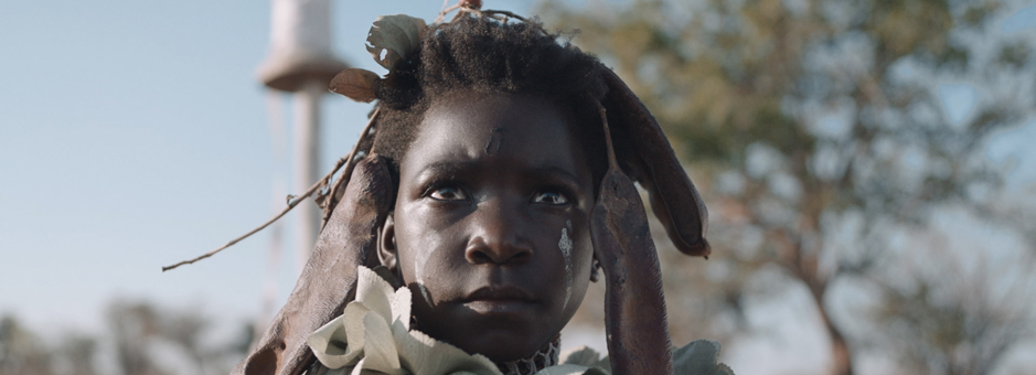
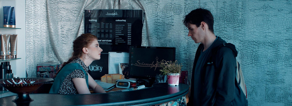
From the outset, director and screenwriter Rungano Nyoni was very clear she wanted to avoid the stereotypes sometimes used to represent Africa. She really wanted to ground the film in reality and emphasize the arid dry nature of the location and setting whilst not making it look overtly hostile. She wanted to bring out the beauty of the imagery deftly captured by David Gallego, but without obvious embellishment.
Ironically, films where you don’t want it to look like you have done anything are often the most challenging; inevitably, there is lots to do, especially in marrying styles and crafting the journey of the colour and story across 90 minutes. It had to look effortless. We ended up building some great little base styles using a combination of tonal responses and colour cross talk models from film stock profiles. We had to be very careful to iron out the more aggressive tonal results you can get from some stock outputs to keep things gentle. The more organic colour responses, especially in the costumes and landscapes, really helped add that subtle finesse to the colour we were after.What were the biggest challenges?
What was fascinating to me was the convergence of the language that Rungano, David and I had to come to when describing how we felt something looked or how we wanted it to feel. For instance, Rungano’s description of lush and verdant landscape, having much experience of Africa, was very different to David’s, who lives in Columbia with its lush monsoon-drenched deep greens, and to mine with the emerald morning leaves. We all had to thrash out what these terms meant to the colours and landscapes and skin tones in front of us and the difference was a real eye opener. It hammered home how easy it is for both artists and audiences to fall into stereotypes and clichés. Going on the journey to portray Rungano’s Africa with its gentler, more neutral, truth was really great.
I use curves a lot and I find the D-Key one of the most effortless to work with across all the platforms. I use it a lot to patch things up where needed and for relighting, especially where shapes just can’t give the right texture or definition. Base Grade had just appeared at the time and so I certainly played with some of the newer tools. Being able to pull down highlights and dig out shadows with more precision than the curves was really very useful, and removed the need for a lot more luma keys that I would usually have been forced to create.
David’s cinematography made my job a lot easier when it came to the wide, open, relentless bright exteriors, and dealing with the variety of skin tones in the film. The Base Grade tools gave us the ability to quickly trim this without always having to delve into keys, especially in skin tones.
Do you prefer grading on your own or along with the DoP and director?
The whole process is a hugely collaborative thing and the route to the best result is always to be spring boarding ideas – fighting it out if necessary! Everyone wants to watch the final film, be it on a cinema screen or an iPhone, and know they did the best they could. We always try to be involved from before the shoot – so working with DoPs, especially with references, style-finding grades and LUTs created for on-set are all a big part of it.
It’s also critical, however, for the team to be able to have a perspective – to leave the suite and come back fresh – so I think it’s always important to not slavishly have anyone stuck in the suite. Normally we will have a patch of time where I flesh out some reels and then we review, which I find can help a lot of people get where they want to go quicker. It’s easy to get snow blinded quickly. I always take peoples’ first reaction as vital on reviews as well. Too many times you can go back to a shot that jolted someone and have them say, “oh, maybe I was imagining it” when they see the clip repeated 20 times upon investigation. But it’s all about the run - if it felt odd having watched the previous five minutes it will be there the next time you see it.
What are your thoughts on the new features in Baselight v5?
I love the Base Grade tweaking you can make in high- and lowlights. It digs out detail in a way that previously always took time with keys. Especially in the shadows, it is the Holy Grail for me to get rid of those cloggy blacks you can get when trying to shift a scene’s contrast away from its base. I’m also a big fan of the Shader layer that sneaked in – it’s opened up a huge number of additional options for doing more than just adjusting colour, bringing online and effects work into an easily accessible option in Baselight. This has really helped open up what I can offer a client stylistically. The Perspective Tracker has also been very useful, as has the Paint tool for tackling those annoying little things that otherwise mean jumping out of Baselight and into another application.
What are your thoughts on HDR?
I think, like anything, it’s audiences that will drive its uptake. If the huge move to mobile devices is evidence of anything, it’s that content is king. If it’s engaging and entertaining, audiences are happy to absorb those stories and people on the smallest and simplest of devices. That said, I think HDR brings an exciting extra dimension to the viewing experience, opening up a whole new set of opportunities creatively. So it’s a brilliant thing we are exploring, but HDR does have to demonstrate that it can consistently give something more to audiences over the long term. In reality I imagine it will be one of those things that TVs will simply have as standard in the coming years, much like 4K is now: a silent transition, whether the audience appreciates it or not. Once that happens, the difference on a TV between a production that’s invested in an HDR version will clearly distinguish itself from an SDR show – so I think that’s where it will really snowball.
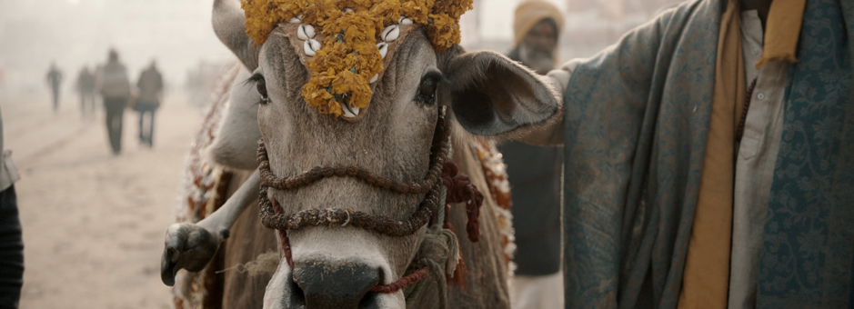
Netflix has some very forward-looking and rigorous requirements across the board, from acquisition formats and colour management all the way to final delivery, and it’s great to see such value and confidence placed on the content they make. We worked natively at 4K in Baselight with all the input formats, which ranged from Sony and RED cinema cameras all the way down to restored Umatic archive and stills scans. With a documentary film holding such an eclectic mix of media it was great to be able to engage with Netflix in such a dynamic way, as their team was able to find a path that got the best results but still came in on budget.
What colour grading project are you the most proud of?
I’ve had my job made much easier by being able to work with some really great DoPs. There are a couple of films I’ve worked on with an amazing cinematographer called Felix Wiedemann that I’ve loved. The Go-Between, the recent BBC remake that won Felix the BSC Best Cinematography award last year, was great – it’s always a challenge to squeeze the most out of three days on a 90 minute drama, but I think that worked out nicely. Stratton, an action film I worked with Felix was also really great fun! Very recently, VS., God’s Own Country and Postcards from London are amazing films that we were also all very lucky to work on.
If you can tell us, what are you working on next?
We’ve got a busy year ahead! The Corrupted, a thriller starring Timothy Spool and Noel Clarke, and a great indie movie called Monsoon, set in current day Vietnam and the sophomore project from Hong Khaou, director of Lilting. Plus some great documentaries: Motown for Fulwell 73 and Maiden for New Black Films, a fantastic telling of the first women to sail around the world in the Whitbread race. We are also working on a Sony game for PS4 called Erica, a live action interactive experience that will be out next year.
If you were not in colour, what would you most like to do?
Maybe be born a couple of decades later and get some of that Mars mission action.
Join In
If you want to participate in our MTC programme, we'd love to hear from you. Contact:
Alexa Maza
e: [email protected]
“Ironically, films where you don’t want it to look like you have done anything are often the most challenging; inevitably, there is lots to do, especially in marrying styles and crafting the journey of the colour and story across 90 minutes.”
Details
Colourist: Matthew Troughton
Role: Head of Picture Post & Senior Colourist
Web: Creativity Media


