Case Studies
The colour of Dreams (Sex Love)
Dreams (Sex Love) is a 2024 Norwegian drama film written and directed by Dag Johan Haugerud. It is the third part of a trilogy, after Sex and Love, looking at the complexity of human relationships, sexuality and social norms.
The film follows Johanne's (Ella Øverbye) infatuation with her French teacher Johanna (Selome Emnetu), causing tension with her family as they confront their own unfulfilled dreams and desires.
The film was released in Norwegian theatres on 4 October 2024 and made its International premiere at the 75th Berlin International Film Festival in February 2025, where it won the Golden Bear in the Main Competition.
It was shot by DoP Cecilie Semec and the colour grading was led by Christian Wieberg-Nielsen, supervising colourist at Storyline Studios in Norway.
Organically discovering the look
For the previous two films in the trilogy, Sex and Love, Wieberg-Nielsen was involved from pre-production, but due to unforeseen circumstances, Dreams was a little different.
“I wasn’t able to start in pre-production, because the DoP was sick with COVID during that period,” explains Wieberg-Nielsen. “So, the film was shot using the standard ARRI Alexa look, without any predefined LUT or colour pipeline.
“Unlike the previous two films, where we had pre-established references, Dreams required us to discover its look organically in the grading process. This open-ended approach was exciting but also added a layer of complexity, as we had to shape the colour language from the ground up.”
Visual goal
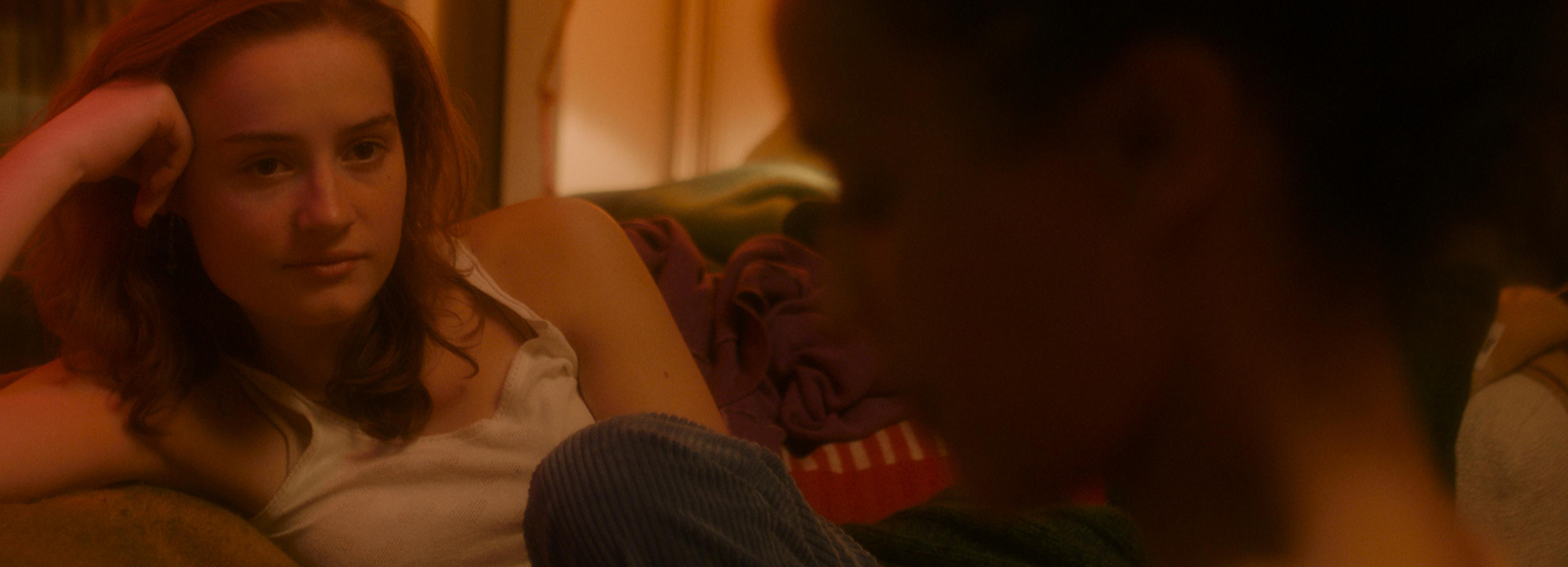
The visual goal for Dreams was distinct from the previous two films in the trilogy. Dreams was the darkest of the three films—not in tone, but visually.
“It was designed to be closer, more intimate, and more emotional,” comments Wieberg-Nielsen. “The DoP already had a clear vision for this film’s look in her photography, and our job in grading was to continue what was already present in the cinematography.”
A dynamic collaboration
Wieberg-Nielsen had worked with the DoP before on smaller projects, but this was the first time that the director, DoP and colourist had worked together on a feature film.
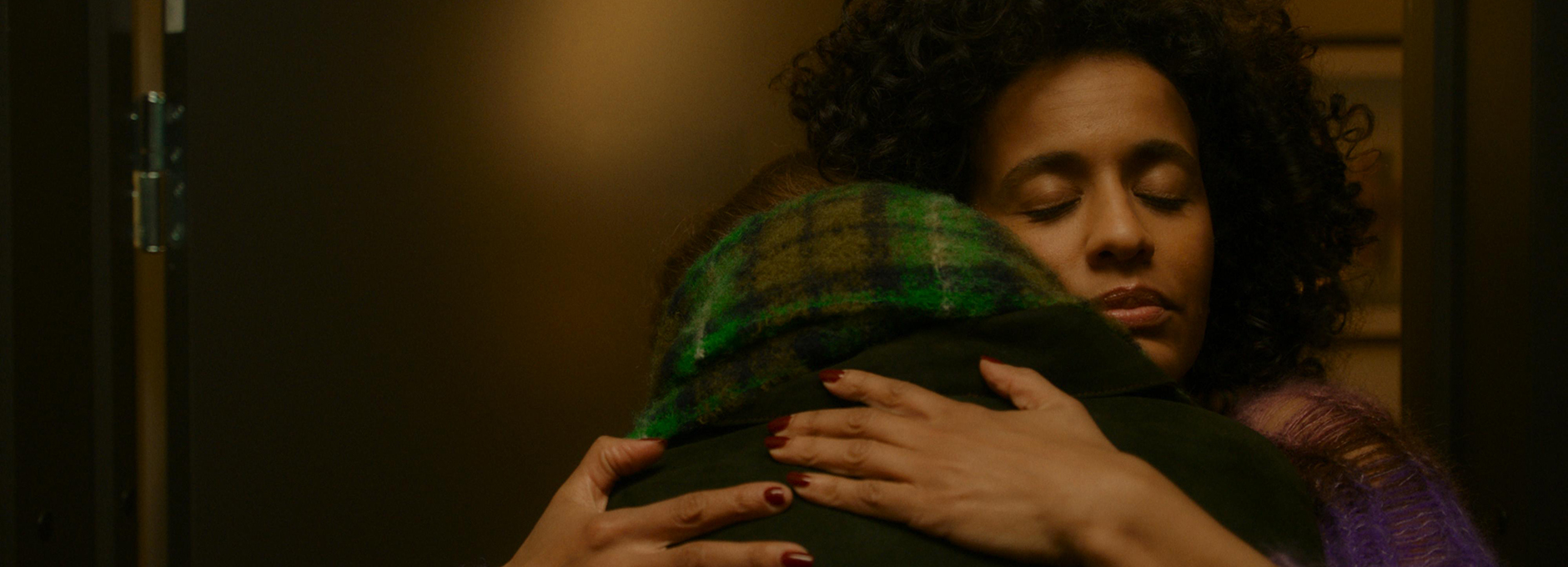
“The collaboration was dynamic because the director had a very strong vision for the visuals, and his preferences sometimes clashed with the more restrained, naturalistic sensibility of the DoP and myself,” recalls Wieberg-Nielsen. “While the DoP and I initially leaned towards a softer, more subdued look, the director wanted richer, more vibrant colours.
“This contrast in approaches led to some creative friction in the grading suite, but it was ultimately very productive.”
Balancing rich with natural
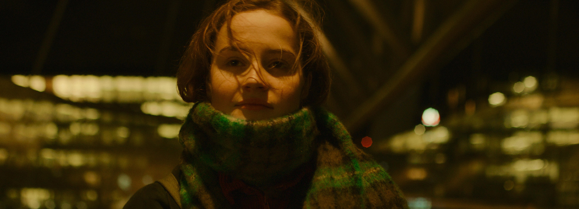
The key challenge for Wieberg-Nielsen was to integrate the director’s preference for bold colours while keeping the film grounded in the naturalism that fit its intimate, character-driven storytelling.
“The vibrant colours needed to integrate seamlessly into the realism of the film,” explains Wieberg-Nielsen. “Finding that balance was a challenge but ultimately led to a much stronger final look.”
“Through careful adjustments, we found a way to maintain the softness and warmth that defined the film’s aesthetic while still embracing the expressive colour choices that the director wanted,” says Wieberg-Nielsen. “This balancing act allowed us to find a look that all of us were happy with—one that retained the softness and warmth the DoP and I aimed for while still incorporating the richer colours the director was looking for.”
To support this goal, Wieberg-Nielsen, who has been grading on Baselight since he joined Storyline Studios in 2018, utilised multiple Baselight 6 tools.
“Chromogen was essential for handling the film’s strong colours in a controlled way,” he says. “It helped create a natural saturation roll-off, ensuring that highlights had a soft, filmic desaturation while still maintaining rich colours in the midtones and shadows.”
“I also used X Grade extensively for shot-to-shot balancing, especially when colours were shifting in unwanted directions,” adds Wieberg-Nielsen.
Staircase scene
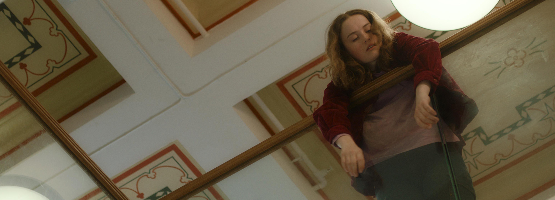
Another technical challenge was a sequence set on an outdoor staircase. The establishing shots of the stairs were filmed with heavy fog, but later shots of the same scene—filmed at a different time—had no fog at all.
“To maintain consistency, we used Depth Maps in Baselight to subtly lower contrast and add a touch of diffusion to the background in the later shots, creating a smoother transition between the misty and clear footage,” says Wieberg-Nielsen.
Voiceover
Since the film is heavily driven by voiceover, it was also important for Wieberg-Nielsen to ensure that the look didn’t create any sense of detachment.
“Voiceover as a storytelling tool can sometimes make the audience feel distanced from the film’s narrative, so we had to work against that by keeping the visuals intimate and grounded,” explains Wieberg-Nielsen. “Using voiceover so extensively is quite an experimental choice, and we needed to counterbalance that with a look that brought the audience closer to the characters.
“This meant that there could be no artificiality in the colours—everything had to feel real, yet still maintain the softness and warmth that defined the film’s aesthetic.”
Textures
Textures were also key in this film. The production design included a lot of wool, soft textiles, and cozy, warm interiors, and the colour grading needed to complement that by keeping the look gentle and moody.
“A great example is the scene in the teacher’s apartment, where the warm lighting and soft production design created a strong, intimate atmosphere,” says Wieberg-Nielsen. “The grading process focused on maintaining that warmth without neutralising it.”
Laser projection challenges
Wieberg-Nielsen and his team were also met with an unexpected challenge when they came to test the final DCP in both Xenon lamp and RGB laser projection.
“We noticed a significant difference with the RGB laser having a higher contrast and sharpness, which affected the film’s soft look,” explains Wieberg-Nielsen. “To compensate, we used Texture Equalizer in Baselight to soften the image, ensuring that the film retained its softness on laser projection and at the same time being acceptable on a Xenon.”
This experience led to deeper research into Metamerism and how different projection technologies impact colour perception. As a result, Wieberg-Nielsen attended Metamerism Expert Day in December 2024 and co-authored a technical article on the topic for IMAGO.
“Moving forward, I believe it’s crucial to test final grades in both Xenon and laser projection before locking them, ensuring that the film translates well across different viewing environments,” says Wieberg-Nielsen.
A huge undertaking
“It has been a fantastic and unreal ride being part of this trilogy—Sex, Love, and Dreams,” saysWieberg-Nielsen. “The films were made back-to-back, with production, editing, and colour grading happening in succession, making it a huge undertaking.”
“Seeing how well these films have been received has been incredibly rewarding,” he adds. “Sex was selected for the Panorama section at Berlinale 2024, Love was in the main competition at the Venice Film Festival, and Dreams won the Golden Bear at Berlinale 2025, which was an incredible milestone.
“It has been an honour to do the colour work on all three films,” he concludes.
“Chromogen was essential for handling the film’s strong colours in a controlled way. It helped create a natural saturation roll-off, ensuring that highlights had a soft, filmic desaturation while still maintaining rich colours in the midtones and shadows.”


