Case Studies
Enhancing cinematic realism through colour grading for Drii Winter
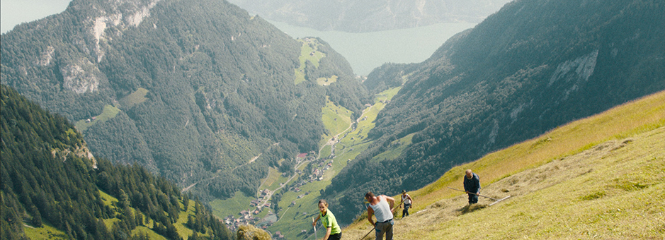
Written and directed by Michael Koch, Drii Winter (A Piece of Sky) is a feature film set in the Swiss Alps. In a remote Alpine village isolated from the outside world, the movie follows Anna and Marco as they experience the joy of new love and the closeness of family.
The scenic film, which was captured by DoP Armin Dierolf, took home the best feature film award at the 2023 Swiss Film Awards. It was graded on Baselight by Timo Inderfurth at Cinegrell in Zurich, who played a pivotal role in creating the unique visual atmosphere for the landscape-rich 2.5 hour-long movie.
Finding the vision
When director Michael Koch approached Dierolf about Drii Winter, the film’s vision was not yet finalised and Koch was open to exploring different approaches.
“Michael had a strong tendency to the academy aspect ratio 1:1.37 (4:3), but in terms of camera movements and blocking, I felt he was looking for something special and not yet crafted,” explains DoP Dierolf. “We completed location tours to discuss the places and people and how we could approach the visual language. In finding the visual concept we started with the idea of following the actors intuitively with a handheld camera with the intention to give them as much space as we could, to a more grounded and ‘stage-like’ visual concept of static and precise set-ups that turned out to be the visual heartbeat of the film.”
Although initially Koch and Dierolf wanted to shoot the movie on 35mm film, for a variety of reasons – including high shooting ratio, a limited budget, and the difficulties of the Pandemic – they ended up shooting 100% digitally.
“When I realised that it wasn’t possible to shoot it all on film, I wanted to shoot the beginning and the end scene plus the choir scenes on 35mm, to have a crystal-clear reference of 35mm in the film and set a tonality that the digital material could match in terms of colours, contrast and texture. I believe that the very first images you see in a film play a very important role to plant a visuality in all its aspects – texture, colours, length, perspective, brightness, darkness, etc.
“This combination of film and digital still would have been my preferred choice, but the Pandemic hit us hard in the very beginning of the production and things became unstable, so we ended up creating our interpretation of 35mm film fully digital. I made precise tests and created LUTs for the ALEXA Mini to match our digital source material to film stock,” recalls Dierolf.
The desired look
Inderfurth joined the Drii Winter team before shooting began, which gave him the opportunity to work closely with Dierolf and the director on the film's look from inception.
“There were two main goals,” recalls Inderfurth. “One was to get a very film-like look, matching the digitally shot parts to the film – even though, in the end, the whole movie was shot digitally. But it was even more important to the director to stay close to realism. Not letting the look take over at any point. Apart from the visual references from the look test which had partly been shot on film, we also had some analogue set photography.”
Inderfurth was conscious not to let colour get in the way of or take over from the story telling.
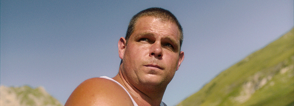
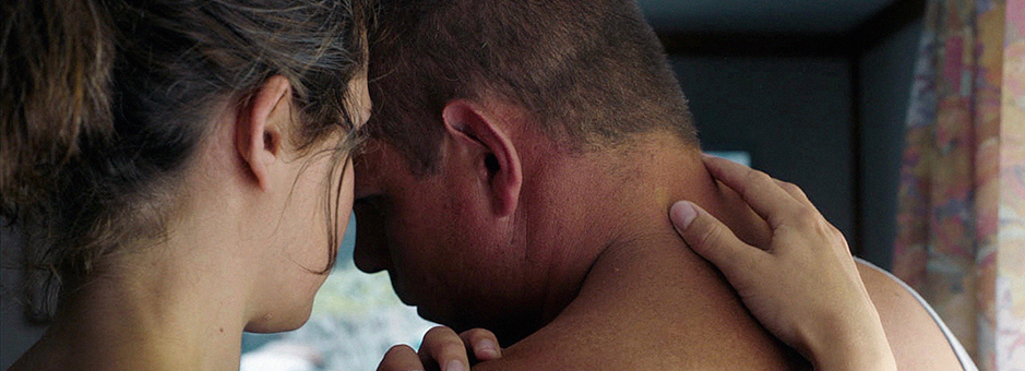
“While the filmic look helps to reduce the amount of colours, we kept the saturation of these high enough to make sure we did not get an unnaturally desaturated palette,” says Inderfurth. “We also went for naturalistic skin tones rather than matching the skin tones of the characters too much, or even doing beauty work. Generally, the movie starts in spring/summer and ends in the winter – so there is a natural reduction of colour due to weather over the course of time.”
A true collaboration
Inderfurth and director Michael Koch had worked together previously, so were familiar with one another’s approach, but they had not collaborated with the DoP, Armin Dierolf, before this project.
“Michael was keen to be part of every decision we took, which I loved,” explains Dierolf. “This only makes the collaboration and the cinematic language more interesting. He joined me for all the lens and camera tests and was interested in observing the creation of the LUTs. He also joined me for the whole period of grading, which was perfect because you really try and make all decisions together – especially in creating the kind of realism we intended to create.”
Inderfurth was with Koch and Dierolf when they were evaluating the 35mm vs digital camera test in pre-production.
“I was very happy to rely on the help of someone who has lots of experience in grading film stock and doing restoration grades,” says Dierolf. “Using the LUT we created in camera and adjusting lights, colour and contrast right on the spot made it possible for us to have dailies without extra dailies grading.”
The team had very few shots for each scene, so matching was not necessary in primaries. Then, in the final grading, they re-worked the LUTs and made final refinements for the screen. Koch also presented a collection of 35mm still photos during his casting process, all of them portraits of people, which provided a reference for the colours.
“The collaboration was great,” affirms Inderfurth. “Having done the look tests before the project certainly made things much easier. Michael and Armin were both present during the whole grading process and we went over each shot many times more than it would be possible on other projects.”
Matching footage
The DoP and director had shot different look tests on location – both on 35mm film and digitally on the ARRI ALEXA – so one of Inderfurth’s key challenges was to match digitally shot footage to the film's aesthetic.
“Even though we went for a colour managed workflow rather than using print emulation LUTs, we still had the Truelight profiles from our in-house film lab available for cross referencing,” explains Inderfurth.
Baselight played a crucial role in managing the colour and maintaining image integrity.
“Baselight’s Base Grade is a great tool for keeping the integrity of the image intact,” comments Inderfurth. “Especially in project like this, where the look has to be subtle and not distract from the story at any time.”
“One of my favourite things about working on Baselight is the Blackboard control panel – it’s really intuitive and sets Baselight ahead of other systems, where you would likely be working from a GUI,” adds Inderfurth. “The colour management and format mapping are other things which makes our work much easier, especially on projects with mixed sources. Plus it’s stable, which is important!”
Working with extended shots
During pre-production, the team discussed the scenes, time space and the rhythm of the film and made the decision to incorporate a selection of long static shots.
“It was an unusual project because the movie is 2.5 hours long, with very few edits,” explains Inderfurth. “Even though this sounds like a very easy job at first, it means that most of the shots are incredibly long – and in many of them, there is little or no camera movement. This means we are looking at a static image for much longer than we are used to, and so they had to be even more ‘perfect’ than the usual two second shot.”
“The challenge of long static shots without possible cutaways is to make them work from A to Z in terms of camera movement, lighting and rhythm,” comments Dierolf. “I love those challenges because they make you move away from the ordinary. Still, we were not dogmatic about that and if we thought we needed another shot or a possible edit we immediately set it up. I really appreciate that freedom.”
The long shots also posed a challenge for Inderfurth in post, requiring meticulous adjustments to ensure the look remained consistent over extended periods.
“I had somewhat underestimated the challenges that come with extremely long shots,” adds Inderfurth. “We went over each shot multiple times until we found the right balance and could create the desired look on shots as long as a few minutes in some cases.”
In contrast to the large amount of extended and very still shots, some shots had a high level of movement.
“Some sequences, like the car rides through switchbacks and tunnels, were very long with a lot of movement. These required intricate keyframing in Baselight,” recalls Inderfurth.
Vast landscapes
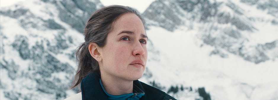
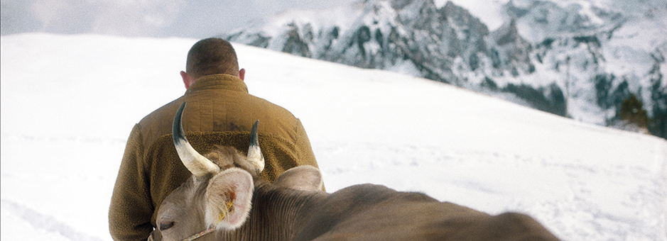
The snow scenes and landscapes needed careful colour separation and saturation control to capture the beauty of the mountains without becoming overly stylised.
“Getting the greens and blues right in terms of separation, saturation and brightness was very important,” explains Inderfurth. “We wanted to show the beauty of the mountains, but not in a postcard-like way.”
“We are very used to grading snow in Switzerland, but it is always a challenge to keep the desired overall brightness in an image without losing too much detail in the snow, so that usually requires quite a bit of keying.”
An authentic portrayal
Drii Winter showcases the pivotal role of a colourist in shaping a film's visual aesthetics, and its success can be attributed to the authentic portrayal of mountain communities and the realism achieved through both the shoot and the grade.
“We are very used to grading snow in Switzerland, but it is always a challenge to keep the desired overall brightness without losing too much detail in the snow. That usually requires quite a bit of keying.”


