Case Studies
Developing the look for Shōgun
Based on James Clavell’s 1975 bestselling novel, FX’s hit series Shōgun is set in Japan in 1600 as a civil war looms.
The series was directed by Frederick E.O. Toye (4 episodes), Jonathan Van Tulleken (2 episodes), Charlotte Brändström (1 episode), Takeshi Fukunaga (1 episode), Hiromi Kamata (1 episode) and Emmanuel Osei-Kuffour (1 episode). It was shot by cinematographers Christopher Ross, Sam McCurdy, Marc Laliberté and Aril Wretblad.
The colour was led by Elodie Ichter, who worked closely with director Van Tulleken and the production team on look development and testing from the beginning.
Ichter began her work on the series in LA, but when the show hit post, she had already made the move to The Mill in New York. Due to her heavy involvement in the creation of the core look, Ichter went on to grade episodes 1-4 remotely from there.
Vision and look development
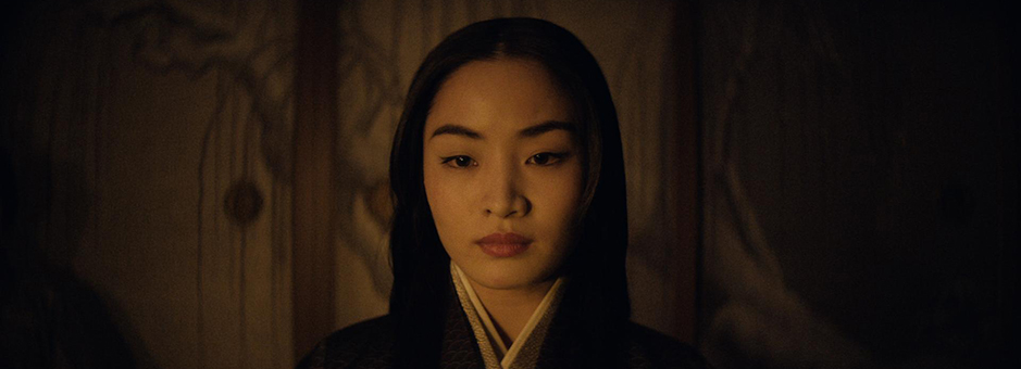
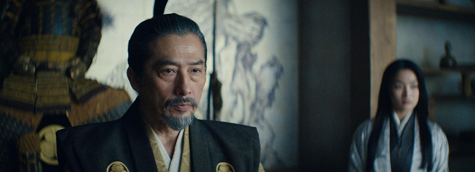
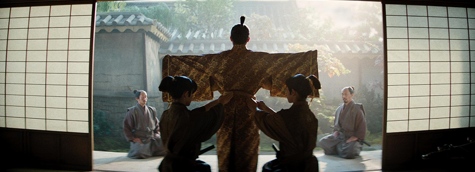
The goal for the look of the series was for it to be rich and colourful but not too saturated – and to maintain the detail in the costumes.
As well as her work on look development, Ichter worked on the grade of the first four episodes of Shōgun. It was her close collaborative work with the director on the first episode in particular that helped to develop the overall show look.
“We spent a lot of time tweaking it and really getting into detail about what we wanted for the show in general,” comments Ichter.
“The costume was crucial from the beginning,” adds Ichter. “I felt it was important to have it integrated in the LUT as much as possible, since it was such an important part of the look. I also set up looks for sunny days, cloudy days, interiors, exteriors – all those nuances are there to start with so you’re not having to find them over and over again.”
There were no specific visual references or inspirational looks to work towards, so Ichter enjoyed creative freedom, creating a look in Baselight entirely from scratch.
“It was all based on conversations,” Ichter says. “We went back and forth between different looks. One day you’ll have something you like and then you can come in the next day to decide you’ve taken it too far. Sometimes we would take it too far just so we could discover what too far looked like. And then we’d try something else. But there were no movie, TV show, music or painting references – we were just creating from what we had.”
Detailed work
“As the series was set in 17th century, the palette was made up of a lot of greens and browns. It was more muted and dark,” explains Ichter. “One thing that was very important was to have differentiation within those muted tones of the costume – without being too saturated and screaming too loudly. This was such an important thing for the story and to enable the audience to follow the narrative, but it was a challenge as it was quite meticulous work.”
To help achieve this, Ichter worked a lot on the details of the black in the costumes and the dark rooms – making sure they did not lose any of the richness created on set.
“What I like about the look is that it’s very rich in terms of colour palette, but it’s not pushing the saturation too much,” comments Ichter. “It was shot on digital, so we tried to make it more filmic, which the lenses helped a lot with too – to bring a more filmic sense.”
HDR and SDR
One of FX Network’s key goals was to ensure that the SDR pass was given as much attention as the HDR, and closely represented the detailed look the team worked to create.
“What is important to understand when you’re doing an HDR show, is that the SDR isn’t just a version we need to have – it is what most people will see and should represent exactly what was created for the look,” comments Ichter.
“I worked on getting the correct colour separation for the costumes, seeing the same small details in the shadows and so on,” Ichter adds. “I worked with two monitors and had the two versions side by side on two separate timelines. Using Baselight, I had all the colour tools I needed to make it match while respecting the nature of HDR and SDR. “
Handing over the grade
While most of the post was managed in LA, Ichter worked on the colour of episodes 1-4 remotely from The Mill in NY while episodes 5-10 were completed by Jill Bogdanowicz in LA.
“I invested a lot of time and care into the creation of the look and it was an honour to be part of the show,” says Ichter. “The collaboration with Jill was great. I shared with her all I knew about the project and how the look was created. Passing over the project to Jill was a pleasure – she is a fantastic colourist.”
Challenges and achievements
“The most challenging element for me was episode one, because it required the most attention. It was the beginning of the journey and set the look for the entire series, so we spent a lot of time getting this right,” comments Ichter.
“Another challenging side was the VFX-heavy work,” adds Ichter. “You work on a scene and then there’s an update, so you work some more on the scene. It was like working on a marathon – new shot, adjusting, new shot, adjusting.”
“I’m most proud of the look in general,” she adds. “It was my own creation from the beginning, and it is great to see that become a critical part of the overall series. I put it together in collaboration with the director, DPs and other key team members, but there were no references or visual guide to work towards or match. It was a full-on creation and I felt truly valued. I love that.”
Ichter has joined Light Iron’s New York facility and sits on the jury of this year’s FilmLight Colour Awards.
“We went back and forth between different looks. Sometimes we would take it too far just so we could discover what too far looked like. And then we’d try something else.”