Case Studies
Colouring The Forge
The Forge is an American drama film directed by Alex Kendrick and co-written by Stephen Kendrick. It is a spin-off to War Room (2015) and tells the inspiring story of a young man's journey for purpose through faith and discipleship.
The film was shot in Albany, Georgia, by cinematographer Bob Scott and the colour was completed by colourist Keith Roush in Atlanta, at Roush Media.
A long-standing partnership
“I’ve had the privilege of working with Keith Roush on six films to-date,” says cinematographer Scott. “He has this incredible, genius-like skill set with colour and texture. There is no problem or idea he can’t fix or bring to life. And, just like a painter who needs to know how to mix paints and what brush to use to create his masterpiece, Keith uses his technical base to creatively mould and shape the film to be all it can be. He is constantly adding a little ‘Roush’ magic to each scene - not satisfied till it’s perfect.”
The Forge is the fifth official collaboration between Roush and the Kendrick brothers, which begun with War Room in 2015.
“We immediately hit it off,” says Roush. “I have loved working with them, and I understand the director Alex Kendrick's vision. I know his creative sensibilities – what he likes and doesn't like. I can anticipate his feedback and put it into the grade before he even asks. Alex is a visual director and knows what he wants.”
Lighting and lenses
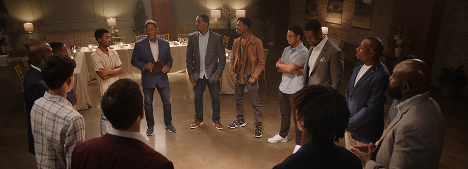
The set was lit naturally, with the team utilising the sunlight, window light and practical light fixtures.
“We all agreed that it needed to feel very naturally lit,” comments Scott. “It sounds easy, but it takes effort to pull off. My gaffer, Jonathan Terpstra, used a lot of big, soft directional light for day exteriors and key grip, Spencer Weaver, would shape the light to create contrast.”
For interiors and set work the team tried to light 'film style' as much as possible.
“This means taking light from the grid as little as possible,” adds Scott. “On stage that is the most efficient way to shoot - keeping stands off the floor. But, it can also start to look a little like a ’sitcom’. For day scenes we would push big light sources through windows and let the light bounce around. We would shape and cut it to achieve the look we liked. Then we would come in and finesse the close-ups with an eye light and contrast.”
Scott shot on the ARRI ALEXA 35 and persuaded director Alex Kendrick to utilise Cooke Anamorphic lenses, using a 2.40 aspect ratio.
“I’m glad he fell in love with it,” says Scott. “I love the way the lenses have this natural fall off, take the edge off the digital camera and give you a real filmic look.”
The vision
The Forge is a sequel to War Room, so the goal was to create a more updated feel of the original movie.
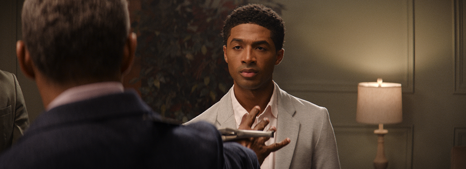
“Alex wanted to keep the same basic look that we had on War Room,” explains Scott. “We wanted slightly warm skin tones and rich texture. Some contrast that created drama, but not loss of detail in the shadows. Earth tones for set design and even wardrobe. We didn’t use a lot of primary colours unless we wanted something to stand out.”
Another visual goal for Roush was to create a look that felt like it was shot on motion picture film. To support this, he spent time adding just the right amount of texture like grain structure and other elements to the images.
“The sensors on most modern digital cameras produce a super clean, very sharp and life-like image,” explains Roush. “This is great if you want to shoot a soap opera, but not if you want to transport a viewer into a dramatic story. The film print emulation we used is rich in contrast without crushing the shadows or blowing out, allowing dark skin tones to resemble milk chocolate and thus keeping the focus on the performances.”
Roush wanted The Forge to feel real and to draw the audience into the characters.
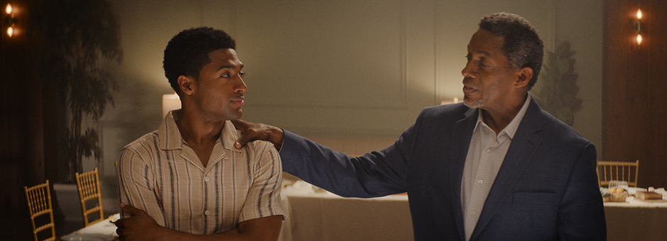
“The story is about how lives are changed when you have a real and true relationship with Jesus and one another,” explains Roush. “The struggles and triumphs are in the actors' performances and so I wanted to focus the audiences’ attention on this through the grade. To do this, I would often bring down the background and pull up the faces, adding contrast and rich warm tones which would make it pleasing while drawing the viewer into the scene in a more intimate way.”
Creating a LUT
Colour on The Forge began long before the actual grading process commenced. Roush created a show LUT from test footage and then transferred the look into ARRI’s ALF4 file format for loading into the camera.
“I shot some test shots with some of our cast members, brought the footage to Keith’s colour suite, and started to create a base look and LUT for The Forge,” comments Scott. “In the past, the film LUT was built into the film stock, but today much of the look is created digitally. I think of it like a glass filter you put in front of the lens.”
To support the LUT creation, Roush utilised Chromogen, the new look development tool in Baselight 6.0.
“The look development tools allowed us to craft custom, rich film print emulation looks that give the images an organic film look,” adds Roush. “For texture, we used grain, halation and texture highlights. We even used several of Baselight’s lens flare tools, also new to Baselight 6.0. I would mix and match all these tools into one strip for the whole film called the look layer. That look was the basis for the show LUT created and then further refined in the final grade.”
“The DoP, director and I loved the look we crafted together because it gave the African American cast beautiful, natural skin tones and separated them from the environment – drawing the audiences’ focus,” says Roush.
“Developing a look for a project and having the cinematographer use that in-camera during production helps to refine the process,” adds Roush. “It allows the DoP to light the show based on the intended final look, rather than starting with a stock 709 LUT and figuring it out later. It ensures that the images maintain consistency across the film and gives us an advantage once colour grading begins.”
“The LUT can be loaded on the camera and applied while you are shooting,” adds Scott. “It’s an amazing tool to have in terms of how it helps you light a scene in real time on set. And the best part is, it’s ‘non-destructive’ – meaning it’s not baked into the image permanently. It can be adjusted in post-production.”
This approach also enables the director, editor and the studio to view closer to the final grade throughout the entire editing process. Once the final grading began, Roush was able to apply the same look he had developed in Baselight to everything, providing a strong starting point for further refining the image.
“The LUTs that Keith is able to create in pre-production are a real visual game changer,” says Scott. “I look forward to working side by side with him for many films to come.”
Baselight 6.0
Roush completed The Forge colour grade in Baselight, which has been his grading tool of choice since 2018.
“Previously, I had graded on Resolve and Nucoda,” explains Roush. “Once you start utilising the tools in Baselight, there is no going back (at least, not by choice). It is fast and flexible and has the best colour tools for creating and controlling your desired look. It also has the best colour management to deliver your grade to any colour output, without fail. If you want the best colour grading tools, there is only one choice, if you ask me.”
As Roush was working on The Forge, Baselight 6.0 went into beta, so Roush utilised many of the new features and tools in the new release.
“I used many of the new tools, from look development to subtle halation, flair and grain texture control,” says Roush. “The new AI tool, Face Track, proved to be an invaluable tool, enabling quick and precise manipulation of the talent's faces across the film.”
With a mostly African American cast shot against a lot of windows and rooms filled with atmosphere, the Face Track tool allowed Roush to lift the light in the characters’ faces, while simultaneously dropping down the room.
“It does a fast and accurate track even when the face is turning to profile and back,” says Roush. “Previously, I would not have had the time to finesse the level of control needed to execute this so well. I was no longer afraid to open Pandora's box to achieve a better colour grade across full scenes.”
Multiple deliverables
The grade was completed for three versions: HDR, SDR, and theatrical (P3 48 nits). This presented a technical challenge for Roush as he worked to ensure all three colour versions were as rich and dynamic as the hero HDR version.
“I was determined for all versions to be virtually identical, while maximising the benefits of each,” explains Roush.
To support this, due to the packed schedule and Alex Kendrick’s limited time, at the start of the DI, the team provided a calibrated monitor to the Kendrick offices, to allow for on-site colour grading and remote colour review sessions.
“Sometimes we were in person, and sometimes we worked through remote colour sessions,” explains Roush. “Alex and I like to spot various parts of the film together and set some looks to make sure we are on the same page, which helps me to know what to look out for as I continue the grade. The foundation of the film was already established before the session, and adjustments were made based on Alex's feedback.”
“The theatrical and SDR versions require a lot more time and effort in colour than you would think, but the results were worth it,” explains Roush. “There is a location in the film called ‘The Forge’, where men gather to encourage and support each other. These scenes were particularly challenging as they had a lot of atmosphere and needed to be consistent while drawing the audience into the faces of the dark skinned actors.”
The HDR grade was completed at 2000 nits on the new Flanders Scientific XMP650. The decision to master at 2000 nits was made to accommodate the increasing brightness and colour accuracy of consumer televisions, enhancing the potential for future viewing.
Dolby Vision was employed to map the 2000 nit HDR grade down to 100 nits for SDR and 48 nits for theatrical release. Kevin Stratton was Roush’s assistant and additional colourist on The Forge.
“Going from 2000 nits down to 48 nits, even with Dolby's smart approach and often excellent image translation across different brightness levels, required more than just a traditional trim pass to maintain the original integrity of the grade,” says Stratton.
A final word
“One reason Alex and I work really well together is because we are both visual thinkers,” says Scott. “When I read scripts or stories, I see images. When Alex writes scripts he sees shots in his head. When he pitches ideas, he visually describes the story. He will come to pre-production with what I call a series of ‘pillar’ scenes. And he will describe exactly what he sees. It’s then my job to make sure we have the resources and know how to capture that same image in the camera.”
“The trust and mutual respect Alex and I share for each other is genuine,” adds Roush. “My clients become my friends, and we share the vision for how the film will impact people as well as a love for the craft and process.”
“The team at Roush Media truly did an excellent job – collaborating with them is always fantastic,” says director Alex Kendrick. “They always make our films look stunning and bring the images to life. We are excited to see how audiences around the globe respond to the hard work and care that has gone into the creation of this film.”
“Developing a look for a project and having the cinematographer use that in-camera during production helps to refine the process. It allows the DoP to light the show based on the intended final look, and gives us an advantage once colour grading begins.”


