Meet The Colourist
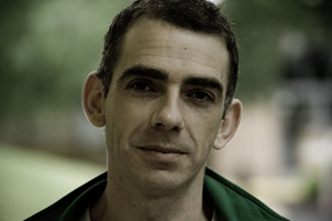
Adrian Hauser
Senior Digital Intermediate Colourist, Cutting Edge
How did you start out in post?
I started out in the late 80's as a runner/goafer/anyone’s bitch/coffee boy at a post house in Melbourne, Australia called Iloura.
How did you get into the job as a colourist?
The facility was giving runners at the time a few weeks training in each department — library, tapes, audio, online and whilst starting in the telecine department one of the colourists went off sick and another went off on long service leave. Pushed into that dark room I immediately found myself engrossed with the strange fascination of the way you could adapt the palette, feeling of light and look of an image, to help it convey the intent of a scene.
Soon after, at the age of only 20, the company set up the first Boutique post house in Thailand and none of the actual colourists wanted to go. My boss gave me an ultimatum to go there and become the senior colourist or leave! I decided to go, and have since worked in London, Thailand, Taipei, and the east coast of Australia. 23 years later, I'm just as intrigued with the nuances and possibilities as I was when I started.
At that time we were working with Bosch FDL60's, MK III's and one of the first released URSA's with the ARCAS controller. I loved tinkering with those machines, having to tweak them continually to maintain the best optical performance. Over time I’ve also had the pleasure of working with some legendary engineers from around the world who would share their amazing knowledge and tricks of the trade.
What gives you a buzz about colour?
The bit that gives me a buzz is that no project is the same. There is no magic button that creates the look required. Just when you feel you have a method that translates to many projects someone will always come along and completely rock your boat in terms of how an image should look. You may struggle to realise their intent and then, a 'look' is borne that completely encapsulates the presence of the scene/film.
The best looking onscreen images are always created by being initially photographed and lit by true craftspeople that completely understand the formats they are shooting. With images like these we as colourists very much take on a polishing role, subtly enhancing the emotive nuances of each scene.
When asked to come up with 'something different' some of the best 'creative looks' I find are initially made by a trial and error approach—stumbled across, happy accidents, that just look better than what you've been previously attempting with the same footage all day. It's funny, I find when something gets too polished, analysed or over crafted, it can loose its uniqueness and begin to just look somewhat ordinary.
That’s what I find unique about grading features. You don't have to necessarily abide by the same colour philosophy that may for example be used in a commercial TV environment. You can throw scopes out the window and really work with your gut instincts. If something is dark, let it play dark, you know the audience is not watching it in a sun bathed entertainment room and their eyes can adjust over the duration of the film to the different light environments.
What sort of jobs do you work on?
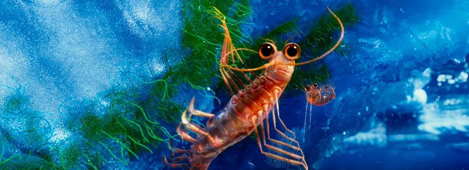
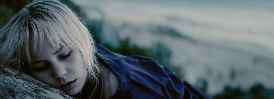
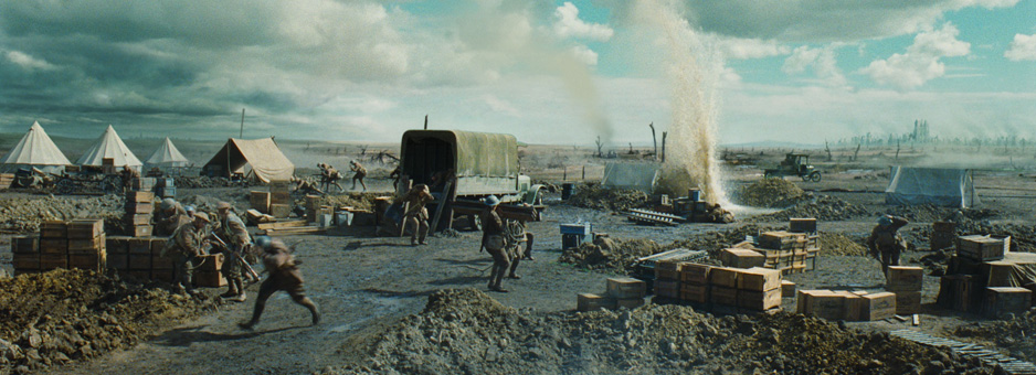
For the last 9 years I have worked solely on "long-form" projects, be that features, TV drama or documentaries. Most recent feature projects include "The Great Gatsby", "Wish You Were Here", "Happy Feet 2".
What makes for a good day at the desk?
A good day at the desk is when a client returns with a new project and is confident to trust your instincts on where the grade should go. I love being at that point in a working relationship where you feel in sync with their aesthetic and are able to make a changes to an image before they have time to verbalise it. As long as they don’t say, "make it look like the flat onelight rushes on my PC screen", then I am happy. Forming long standing working bonds, relationships like that with people makes for a very rewarding job.
What is the best project you have ever worked on? And why?
The most enjoyable projects I work on are where the colour pipeline is collaboratively defined and designed from the start of the shoot. To have everyone on board including the DP, Director, Set and Costume designer, editor, VFX department and colourist all seeing the same thing from the very start makes for such a pleasurable finishing process.
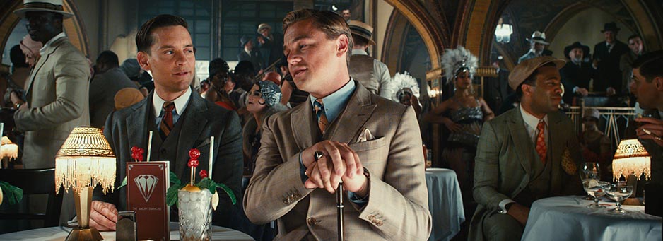
"The Great Gatsby" is the most recent project that I completed. The DI/Grade was overseen by DP - Simon Duggan ACS; Designer - Catherine Martin; and Director - Baz Luhrmann.
"The Great Gatsby" was shot as a true stereoscopic feature. It wasn't post converted. Naturally this required that we set up a grading and finishing workflow that conformed, aligned and was grading in 3D from start to end.
With a little over half the shots in the film being delivered from VFX and the cut being progressively 'locked' up to near one week out from delivery meant the conform was truly a 'rolling' conform. We were constantly updating the cut and adding new VFX shots whilst grading and 3D sweetening the film.
To handle these challenges we developed numerous utilities that automatically updated the spools with VFX updates and edit changes in the background as they came from the editorial department. Within the updates grading and stereo adjustment metadata had to track with the changes, so the tools also had to query the databases of various departments so as to stay in sync. Using the 'hooks' within the Baselight conform tools, we also had to build scripts to interpret the many keyframed resizes from the Avid in a stereo sense. As the Avid was working with side-by-side 3D media the keyframed transforms in the AAF didn't naturally translate across to the DI. The intuitive 3D toolsets and utilities in Baselight were integral to making these kind of processes work efficiently.
Additionally, living up to the challenge of a Baz Luhrmann movie, the conform incorporated a lot of poetic 3D multi-layer dissolves, resizes and transitions which were mostly all finished and stereoscopically sweetened in Baselight. We were able to build a few different types of on-screen depth cue overlays to assess how to best play the scenes in the Z plane. These on screen visual overlays/cues were also used to assess and address stereo geometry and colour alignment problems.
The native stereo material was all shot with a 5% over scanned/safe-area which gave us in post the flexibility to perform HIT adjustments without having to resize shots. It also meant we could make our master framings for the 2D master deliverable and perform the HIT operations on top of that which when adjusting convergence, using both eyes, did not adjust the framing in 3D. Having all these tools available in Baselight made the final 2D and 3D theatrical deliverables extremely easy to maintain.
From a colour point of view we made the move midway through the final grade to start grading completely in 3D at around 4.0 Foot Lamberts. This decision gave us the advantage of both being able to stay on top of the stereoscopic finishing/sweetening procedures as well as seeing the grade play in 3D cinema's notoriously lower projected light levels. The lower light levels of 3D theatrical presentation have a tendency to blanch colour and light from the projected image. We found quite quickly that Baz has an amazingly sensitive eye to colour detail so when played at these levels we allowed ourselves more time in taking special care to retain a distinctive extended colour separation and clarity of our palette in 3D.
Deliverables had to be created as 2D 14 Foot Lamberts (FL) Film and Digital masters and 4.5FL and 7FL Digital 3D masters. With the Truelight toolset we made the master 14.0FL, 4.5FL and 7.0FL brightness adjustments as LUTs activated within the display path making it easy to switch between 2D and 3D. These colour ‘presets’ were then massaged into delivery format LUTs for the digital deliverables in their various colour profiles.
Baz's Great Gatsby is a modern retelling of a classic tale and I believe the graded result is a hybrid between the look of classic cinema with its gorgeous colour reproduction processes and recently matured digital cinema technology.
How much of a part does technology play in the way you work?
Technology plays a big part in the way I work. It does not necessarily play a discernable part in the creative aspect to the grade but I feel to not have an understanding of the colour science, LUTs, colour transforms, image processing methods, stereoscopic image capture and 3D display concepts and data bottlenecks can be undoing of a project especially when problems are encountered and require solving or last minute workflow adaptions. It’s about knowing your limitations with the toolsets and time available.
I choose to grade on Baselight as there are infinite ways of approaching a conform/grade and it lets you explore those possibilities with ease. You can approach a project as technically or randomly as you desire, each approach being easy to navigate and query the structure of the on-screen result. This 'open' approach to the architecture of the software/hardware solution gives the colourist more flexibility and time to query processes and output the project in its many on-screen variants, not ending up in a tangled knot of nodes and time redundant processes.
I enjoy a professional mix of both technology and instinct.
Usually I will find the max performance a technology can achieve, slice off a little, and then devise a workflow that can be achievable in real time within parameters/budget provided.
From a colour point of view, I often begin by pushing an image beyond its break point, thus understanding where it can't go, and then work back from there. Different digital acquisition formats have very definitive break points where-in the graded image will simply be unacceptable when technically quality controlled by a third party. It may look awesome but won't pass the "creative intent" rule :) Such breakpoints stem from visible but often hidden errors like compression banding, channel noise, edge fringing, demosiac artifacts, white point clipping.
The maturation of Digital Cinema is having a large impact on the final look of theatrical releases. In the DI we are now not limited, as we were even a few years ago, by the colour characteristics of what a 35mm print can reproduce on screen and I'm now seeing some gorgeous new hybrid looking results in the cinema. Its a very exciting time to be a colourist.
I am still very much a film acquisition lover, which given the current climate is a little sad. All my references and instincts on what looks good are based around the beauty of what film can provide in terms of tonality and natural density. "RAW" / Digital formats require much more work to get something looking naturally good and keeping that look consistent across a project. It is all about the skin tones and as yet I have yet to see a digital format perform in the skin tones, shadows and highlights like film can. The Arri Alexa gets very close and I'm sure with their background in film scanning and recording will continue to be the leaders in the field for quite some time.
Some newer digital cameras do in a sense give you more control than others in different situations but one has to understand the contributing factors that make up the on-screen result. Fantastic latitude and super high resolution are no match for having amazing glass in front of the 'gate', a kick arse focus puller, modeled light and a spot on exposure.
You can't just shoot a low light scene because a camera can achieve a decent exposure at that level and expect the colourist to add the moulding. The fallacy of remodeling a scene in the grade with tricky shapes/masks and mattes still seems to be out there which I don't agree with.
I have always loved researching and digitally mimicking optical processes, creating digital equivalents of filters, hand processes and photochemical timing methods both old and new. Gracefully integrating these colour ideas with digital photography has made for some gorgeous results thanks to having the Truelight colour toolset within Baselight.
At Cutting Edge in Sydney I not only wear the hat of colourist but also set up the Rushes and Digital Intermediate workflows for each picture. With digital processing methods and acquisition formats constantly changing there is no longer a one style fits all approach. Staying on top of these technological advances in digital imaging and processing is as much of the job as being a colourist.
Where possible I prefer to help set up the rushes and VFX colour pipelines. Not having the opportunity to do this can have painful consequences in the final DI grading process.
Unfortunately for local productions here in Australia it appears that film as an acquisition format is well and truly on its last legs. Neg processing is still possible but prints now have to be sent off shore. It is unfortunate but I guess I will have to get over that one! I know most DOPs who have shot film extensively before would still rather shoot film if they had the chance. The whole extended latitude grain free argument seems a bit of a marketing ploy to me — shooting film never seemed to stop anyone producing amazing pictures before.
Outside of the grading theatre I enjoy going to places where I can invoke a 1000-yard stare instead of a 20-foot stare and take in the nuances of the real world. I enjoy a good vigorous game of squash to work off the cobwebs, a good bison grass vodka and most importantly sunlight, to counter the vampire like nature of working in the dark.
“I choose to grade on Baselight as there are infinite ways of approaching a conform or grade, and it lets you explore those possibilities with ease.”
Details
Colourist: Adrian Hauser
Role: Senior Digital Intermediate Colourist
Company: Cutting Edge, Sydney
w: www.cuttingedge.com.au
In the press
Recent feature films
The Great Gatsby 3D
Wish You Were Here
Happy Feet Two 3D
A Heartbeat Away
Wasted on the Young
Beneath Hill 60
Cane Toads 3D
Daybreakers
Accidents Happen