Meet The Colourist
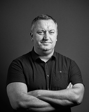
Paul Ensby
Senior Colourist, Picture Shop, London
Paul Ensby has been working in the industry for over 30 years, following in the footsteps of both his father and his grandfather.
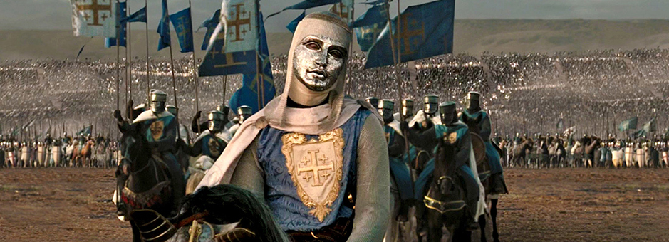
Throughout his career he has worked with a vast number of high-profile clients on features, award-winning episodic series, and Academy Award-winning documentaries. His first foray into digital intermediate was Kingdom of Heaven, directed by Ridley Scott and shot by John Mathieson.
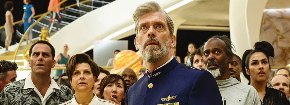
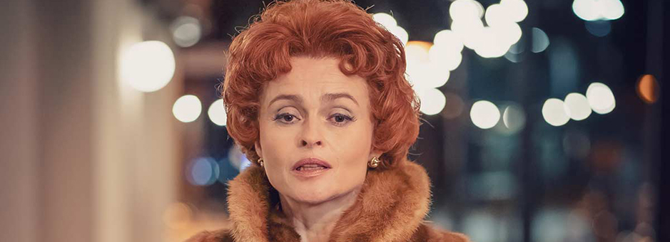
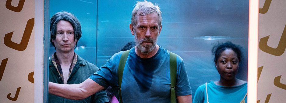
A long-time collaborator with filmmaker Asif Kapadia, Paul worked with Asif to grade the intricate moments on Senna, Amy, and Diego Maradona. Most recently, Paul finished Avenue 5 for HBO, written and directed by Armando Iannucci, and Nolly, directed by Peter Hoar and written by Russell T. Davies.
Paul’s creative expertise and subtle understanding of colour and detail, partnered with his calm nature, is what draws clients back to work with him again and again.
Tell us how you became a colourist. I believe it runs in the family?
Yes. A long, long time ago, in a galaxy far away… my grandfather and father worked at the Technicolor film laboratory, so it is certainly in my blood. My grandfather worked in the solutions department and my dad was a colourist, on 16mm TV – because, back then, the features and TV departments were very separate. And then he became a lab contact liaison for Warner Bros., seeing the films right through from shoot to cinema.
I started in 1990 in the printing department and then a role for a trainee 35mm feature timer came up. I was young and a bit of a ‘lifer’ in their eyes, with the family connections, so I was given the role. A couple of years internal training later I was set loose on the filmmakers of the world and then, once I’d completed three features, I was elevated to the role of a senior feature timer.
So, there I was, in my twenties, unleashed into film grading – which was very different to what it is now. It was primitive, but also just as important to the filmmakers as it is now, and it was a bit of a dark art – all done by eye. A lot of those practices though, I still use today.
How has your role as a colourist changed in the last 30 years?
I started when I was still relatively young, around the turn of the century when digital grading was on the horizon. It was a mixture of what was happening in the telecine and VFX worlds. Back then, they would scan the odd shot in VFX and it would be graded and dropped back in. But then someone clever had the bright idea of scanning the whole film and doing it that way – and this became the ‘digital intermediate’, as they called it then.
Being young and foolish enough to put my hand up and say ‘I’ll have a go’, I did just that. Technicolor was early to it, as they had their own department to follow in the States so could make the transition. So, without knowing it, I was one of the forerunners of grading digitally in the UK, exclusively for feature films at that stage. Though back then, of course, it was slower and processing power was churning away a frame at a time.
I think people are far more aware of colour now than they used to be – especially with modern apps like Instagram, where they can edit photos and adjust and apply colour. Previously they didn’t have the ability to do this – we took a photo, it went off to Boots to be processed and it came back unedited for us to see what we had captured.
Our role today is to help tell the story and frame the eye to parts of the image. This is very important to the director, as they don’t want the audience looking at a plant in the corner of the shot that is too bright or too green, for example.
Generally, the use of colour has evolved and become more upfront. People are certainly more aware of it and look out for it more. Even though, effectively, our work should never be seen and not be too ‘in your face’ – unless, of course, it’s meant to be.
Variety is the spice of life, as they say.
Historically, I’ve grown up with features. And even 10-15 years ago I was spending 80% of my time on them. But, because of Netflix and the other streamers that have arisen, my work is now more heavily in episodic/series.
Every genre has its own challenges, and they are all just as enjoyable for me – I don’t really have a preference for one or the other.
The documentaries I’ve been involved in are more archival based, which means they don’t have a DoP and my role becomes more than just a colourist. This is great, as you feel more part of the process and highly valued.
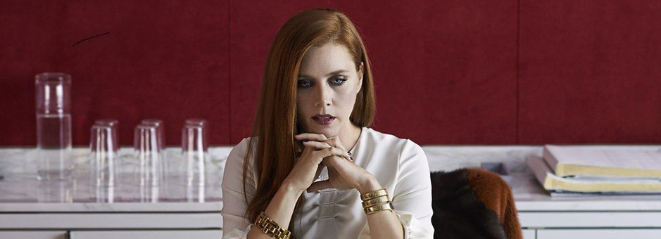
Yes, it was very interesting working with Tom Ford – he is quite a character.
If I remember rightly, the DoP wasn’t around very much so it was very much Tom’s show. He had a particular colour palette that we stuck to. They’d done a lot of work in prep, on-set and costume and knew the direction they were looking for. For me, it was about manipulating in a very small way.
Tom was very involved and was there for every frame. He is a very visual person and knows exactly what he wants. From my perspective, I’d much rather this than the opposite, as it can be hard to get inside people’s heads and translate what they’re looking for – especially when they don’t know themselves!
It was a great looking film and he was a very interesting person to work with.
I love working with Asif. We have a great relationship and I really regard him as a friend now, more than a client.
I was lucky enough to work with him on his first few projects, which won BAFTAs and Oscars. I was actually in the USA when they won the Oscar, and went along to the after party, which was a huge highlight for me.
Our relationship began one day when he came into the suite, almost unannounced, and brought in a test sequence of this motor racing thing called Senna. At the time, I didn’t even know if it was a film or a TV show – we had very little information.
It turned out to be something quite unique as it was all archive footage, and the project was about trying to make ‘80’s archive footage look like a feature film. We spent time bouncing ideas around, talking about how we could achieve their goals, how we could re-frame it, and the best way to realise their vision.
We quickly learned that Asif likes to be totally flexible, even at the last stage of the process, so everything is always live. Normally, a film is cut, conformed and titles are set out where they should be, but here we kept it all live. If we wanted to drop or move a title, or change the wording, we could do that live in the grading suite. Working this way means it becomes more than just a grading exercise and more of a finishing bay – everything is up for grabs.
And, when you’re doing this with someone, and you have their complete trust, you quickly build a relationship. I feel very much like I’m part of Asif’s team now. He involves me in so many things and meetings that I would not normally get involved in. He really listens to and values my opinion. It’s nice to be so involved and heard.
He’s also very keen on little things like putting your name high-up on the credits, or on the poster, even – which is almost unheard of for a colourist.
How was your experience working on Kingdom of Heaven?
Kingdom of Heaven was the first digital intermediate I did at Technicolor, which is now part of Picture Shop. It was a big, epic project for me to be involved in. I remember my boss asking me, ‘are you interested in doing this?’, and obviously I was, but I was also totally petrified as it was really important that it went well.
I had worked with Ridley Scott in the film days, as a 24-year-old, so I had a slight link there. But it was a very different kettle of fish doing it in front of all this new technology, so I kept it very simple and very close to my film roots. And I think it worked well as it ended up looking really nice.
Can you tell us about your grading suite and workflow?
We have several Baselight systems in the facility and I’ve been grading exclusively on Baselight for three years now. I haven’t looked back. I’m very much enjoying working with Baselight and it does everything I need it to do.
There’s lots of little tricks and things that I like about it. The in-house grain tool, for example, is one of them. A lot of people shoot on digital now and want it to look like film. So, I’ll intuitively roll off the highlights, utilise Base Grade to isolate, so I can just roll them off the top to make it look ‘filmic’.
I’m used to looking at film and I naturally lean towards this look myself. I’ll do things like ‘dirty up’ the image, create less ‘whitey’ whites at the top end, apply a grade, possibly a bit of vignetting, and suddenly it starts to take shape.
Baselight has all these tools available and they work perfectly for me.
I’m currently finishing up a couple of series for ITV – Three Little Birds and Archie – which will air Autumn time.
I’ve also graded an independent feature film, The End We Start From, starring Jodie Comer and I have another feature documentary in the can, too called We Dare to Dream which has been directed by the Academy Award winner, Waad Al Kateab.
All very busy and exciting.
Join In
If you want to participate in our MTC programme, we'd love to hear from you. Contact:
Alexa Maza
e: [email protected]
“Working with Ridley Scott was great. Some directors are about the acting or performances, but he is about the whole thing. He doesn’t miss anything.”
Details
Colourist: Paul Ensby
Role: Senior Colourist
Web: Picture Shop


