Meet The Colourist
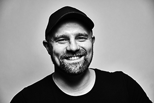
Sebastian Göhs
Freelance Colourist, Germany
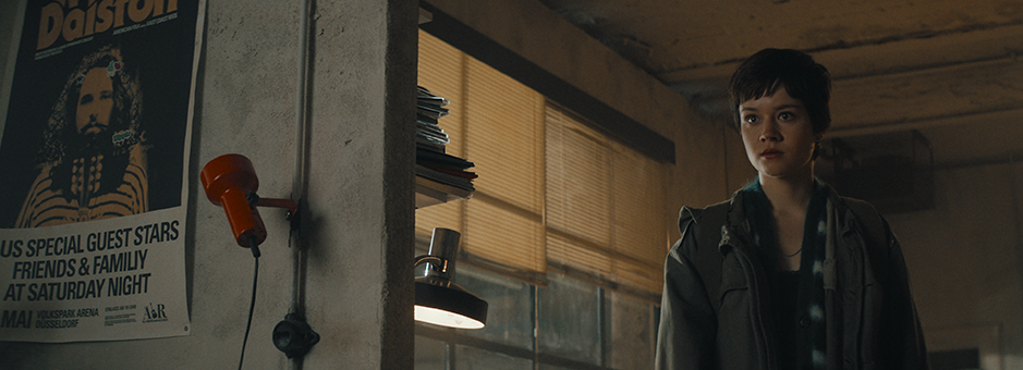
Based in Berlin, Sebastian Göhs is a freelance senior colourist who works on high-end HDR content across feature films, TV series and commercials. He recently graded one of Amazon’s top-shows in Germany, The Gryphon (2023), on Baselight. In the past he graded In Darkness which won the Golden Frog at Camerimage Festival in 2011 and was nominated for an Academy Award.
Tell us about your journey to become a successful colourist.
I’d love to tell you that I always knew I wanted to be a colourist, but it wasn’t quite like that. Through the years I have been lucky enough to have the support of a company and an environment to develop in, which came with many opportunities for me.
I started my vocational education as a film and video editor in 2002, at one of the oldest film labs in Europe, Geyer Berlin. After working in the telecine department and the VTR room, I moved to the Digilab, where I learned to use different software packages such as Shake, Flame, Smoke and Digital Fusion and did film scanning and recording on ARRISCAN and ARRILASER. I also worked with Avid, collaborating with our tech department to set up editing rooms and take care of the dailies process and sound syncing. Here, I acquired a good understanding of the different stages of the post-production process before I moved into colour grading.
When our company made the switch to non-linear colour grading, our house decided on Discreet Lustre and needed someone to teach our colourists the tools. As I was familiar with the linear tape-to-tape and telecine workflow, as well as Flame and Smoke, I became a Lustre assistant and got to sit in the grading suite, working in tandem with the senior colourists.
Soon enough I had the opportunity to work on a full feature film with a DoP and a director that knew me from a past project. It went well and from there I got the chance to prove myself as a full-time colourist on several follow-up projects and eventually had my first encounter with Baselight.
What type of content do you usually work on?
Usually you’ll find me working on high-end feature films and series with the occasional art project, music video or commercial from time to time.
How do you think colour shapes the way audiences perceive film?
I would say colour shapes images in a very similar way to how audio influences a story. Colour can mould the picture in different directions, whether it is dark and gloomy, sunny and happy, sad or suspenseful. We can enhance certain parts of the image as well as dial back or hide certain things to direct the viewers’ attention to where the DoP and director want it to be.
A look won’t make a movie, but poor colour grading can break the connection with the audience. A frequent request is the emulation of certain film stocks or a “film look”, to bring a somewhat analogue feel to the footage and take off the digital edge.
How do you know when a specific colour scheme does or doesn’t work?
It’s mostly a gut feeling. Usually, I have a strong reaction to a colour palette and contrast and whether or not it goes well with the story, or if it counteracts it and drags the attention away. I use the tools to steer the footage accordingly without being too technical about the process.
However, the DoP and director are always my most important guides. In the end it is their show.
What’s the most challenging part of your role as a colourist?
What I find hardest is the psychological component when there are creative differences between production, the director and the DoP. Compromise tends to make people unhappy, especially if it’s negotiated late in the process. Surprisingly there is a lot of communication problems and politics involved in a process that should be straightforward.
How do you like to collaborate with the director and DoP on a project?
I like to get involved as early on in the process as I can, develop the look and on-set LUTs for the cameras, talk to the on-set colourist. With this, there is little surprise.
The better the preparation and the closer the dailies are to the direction the DoP has envisioned, the less we debate, because production and the director get accustomed to the dailies during the editing process. When the look changes significantly there is a higher chance of experiencing problems during the approval sessions. The psychological component can become strong sometimes, as ‘different’ can often be perceived as scary and the fact that the new look might be better or more fitting in several ways can be overlooked.
What’s the market like in Germany at the moment?
It’s difficult to say. Like much of Europe, we are on the verge of a big recession and the government here is still deciding where they stand on it.
The German film industry has always been different due to the production system here, and even though the last few years have not been bad, we need some serious reformations. The raising interest rates and inflation have wrought havoc on a bunch of projects and productions.
Then there is the situation with the writers’ strike, which is affecting international productions. I am not seriously worried yet, but we will see how things develop next year and if the German film industry will bounce back.
How long have you been grading on Baselight and what’s your favourite thing about the system?
My most intense time with Baselight was from 2015, when we built the picture department at Rotor Film. So, I have been using Baselight for eight years now, and it has become my go-to system ever since.
My favourite thing about the system is its flexibility, technical quality and colour management. The toolset is always evolving and the support from FilmLight has never let me down.
How would you describe your grading style and how does Baselight help you with this?
I like to start with a general look and feel and chip away piece by piece over the project, ending at the final product. Usually our grading time is limited, while there is a certain development on the high-end serial projects to offer a more generous amount of time to push the quality of the grade.
The Baselight toolset and built-in core looks combined with its ability to move seamlessly between cinema, SDR and HDR outputs brings reliability and security to the productions. Working on Baselight means I can move faster and produce great results quicker.
I got involved rather late in the process, which is unusual for a German production of this size. The look development was done by a different colourist before the shoot and it evolved even further on set during the production.
This meant I was confronted with a certain set of expectations for the look and the grading system, which was Resolve when I arrived on the job. However, there were several problems with the dailies grades and the LUTs, so after spending some time looking through the set-up and talking things through with the DoP, the technicians at the post-house, the post-production-supervisor and the DIT, I was able to convince the team to move the job to Baselight. Here I could re-build the core looks using bits and pieces from the original set-up as well as the Baselight toolset.
It was clear that the picture pipeline had to be re-built from scratch, including the core looks, and I did not want to compromise on the quality of colour management, the toolset and performance. I knew that I would have to deliver an HDR master, but at the same time try and make the DoP – who was used to SDR workflows and SDR references – 100% happy. FilmLight’s Truelight Colour Spaces lets me move between display spaces seamlessly, so I could give the DoP the confidence that his SDR master would be exactly as he likes, without having to compromise on the HDR master.
What was the desired “look” for the series and how did you achieve this in Baselight?
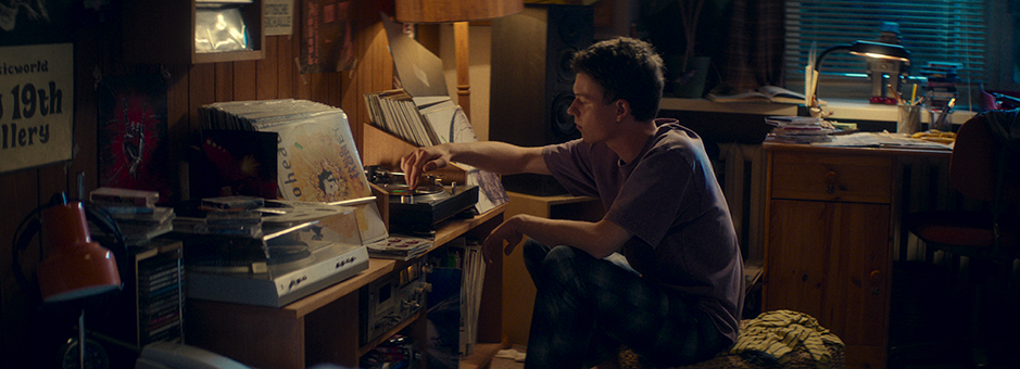
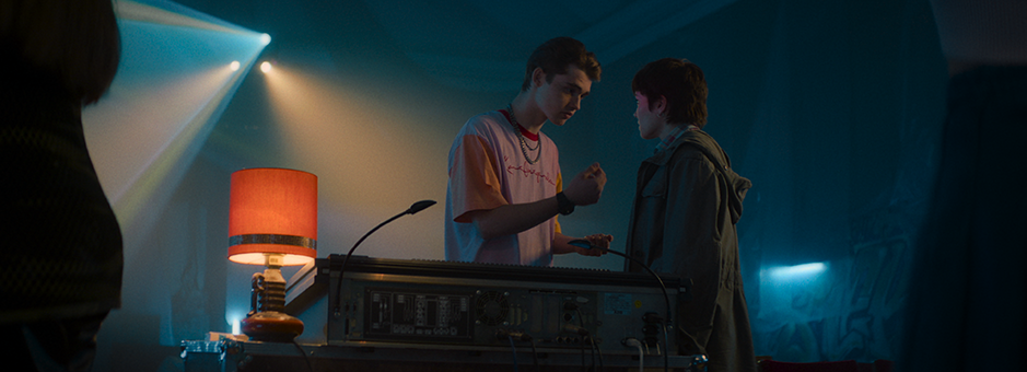
The main idea was for the DoP and the show runner to create a nostalgic feel of the ‘80s and ‘90s cinema – the Amblin movies in particular. The DoP was very insistent about a certain Kodak 2393 print simulation he used during look creation, so I based the main show look on that, working out the quirks and limitations so we had a good base for our HDR master.
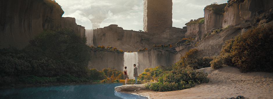
We kept the ‘here and now’ plane at a medium contrast and a realistic colour palette to contrast the otherworldly nature of the dark tower.
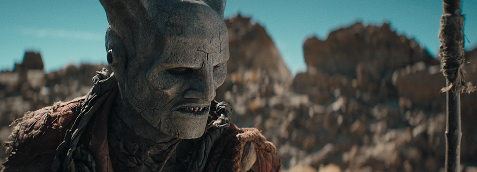
This otherworldly look was achieved very much in spirit of the '80s/’90s movies, mostly through set decoration, costumes, practical effects, well-placed VFX, and some help in colour grading. We darkened the skies wherever it seemed appropriate, gave it an otherworldly colour and enhanced the colour of the vegetation, to get the message across that they were not in Kansas anymore.
The dark tower is a weird world with strange creatures and different biomes directly next to each other.
For the flashback sequences we went for a more low-contrast, pre-flashed magenta look, as the DoP was very keen to stay on the analogue side of things.
I own a Daylight license and Baselight LOOK and rely heavily on FilmLight Truelight Colour Spaces as well as certain tools in the Baselight toolset. Daylight gives me the full functionality of the Baselight and I can create looks and set-ups that I can move to the full Baselight systems without compromise. Baselight LOOK has some limitations but allows me to play around with compositing effects on the timeline.
For other grading systems, I generate 64x64 cubes of my looks on a project basis. And if I need access to a class-1 HDR monitor, I usually talk to the post houses I work with.
I am used to working at home and preparing projects on the go and this is my system agnostic workaround.
What do you like and dislike about being a freelance colourist?
As a freelancer, I get to work in a variety of post houses, meet an array of talented people and experience all sorts of workflows. It’s great to keep a fresh perspective on things and I enjoy learning. And, of course, I also get to decide for myself how much I work.
The downside is obviously the life away from my home and kids, the hotel lifestyle and occasionally having to chase clients to pay their invoices. I also miss the ability to sit on a Blackboard 2 in front of a class-1 broadcast monitor, or in a cinema, whenever I like – something which was a lot easier when I was employed as the head of a picture department.
I am just wrapping up a big Netflix show and then I am going on vacation with my kids. When I return, I have a few feature projects and a large serial job in the pipeline.
What do you like to do outside the grading room?
I like to spend time with my kids and family, going to the gym, visiting galleries and gaming.
Join In
If you want to participate in our MTC programme, we'd love to hear from you. Contact:
Alexa Maza
e: [email protected]
“A look won’t make a movie, but poor colour grading can break the connection with the audience.”
Details
Colourist: Sebastian Göhs
Role: Freelance Colourist
Web: Sebastian Göhs


