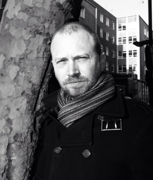
Meet The Colourist
Adam Inglis
Freelance Colourist
Adam Inglis is a freelance colourist, based in London, who has worked on many top film and TV productions including Wolf Hall and Mr. Turner, and has featured in Televisual Magazine’s annual survey of the Top UK Colourists. Adam has worked on various grading systems but has been using Baselight almost since the very beginning.
How did you start out in post and become a colourist? Was it luck or a ready mapped out plan?
I originally wanted to be an editor. Digital feature grading as we know it today didn't really exist back then. After a little time learning Avid in TV, I got a job at The Computer Film Company in their scan and record department. It wasn't editing exactly, but it was features which was definitely where I wanted to be. At the time CFC were just starting to grade certain sequences with the technology developed in-house for “Chicken Run” (this technology later evolved into Baselight). My editing background meant I was soon helping out colourist Adam Glasman with conforms and when digital post really started to take off, I began grading.
What sort of content do you work on?
Mainly features, although over the past few years I've branched out into natural history and some drama telly too.
‘Grading movies vs. TV shows’ - what are the main differences in terms of creativity?
When it comes to drama, the main difference is time. For a 60-minute TV drama we typically get two days, which would be like doing a 90-minute feature in three days rather than ten. So this immediately restricts how much you can finesse, explore and achieve in the grade. Personally, I don't approach the grade on either any differently. There is a notion that TV grades are bright and bland with cinema grades being more moody and unique, but I don't think that's really the case. As television and cinema become ever closer, modern TV drama can be just as bold and artistic as features.
TV natural history is another matter. Natural history is pure cinema in many ways; it's all about the pictures and the juxtaposition. You can't really do heavily stylised looks like we did in Sherlock Holmes, for example, as that would break the feeling of realism, but you do need to give stunning images the impact they deserve. If you have a shot of two actors at a table talking to each other, pushing the grade can make them feel weird, but if you have a shot of two giraffes fighting, you need to push it a bit. Our eyes aren't as sensitive to giraffes as they are to human skin tone, so you can get away with it.
What projects have you been working on recently?
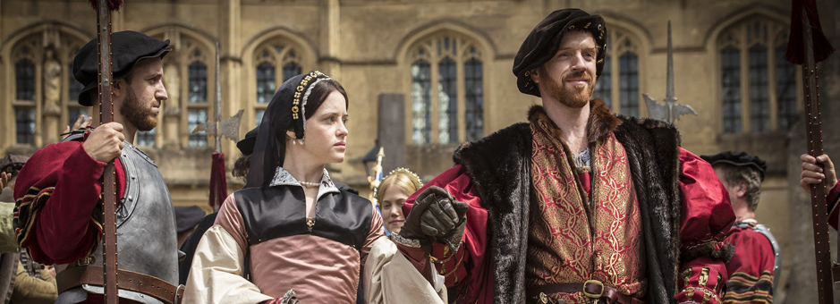
The last feature I completed was a British movie called Kill Your Friends at Pinewood, and my most recent TV project was Wolf Hall at LipSync Post.
Wolf Hall was a perfect example of this collaboration. I believe it should be more than just the three of us in a room for the grade; it should go all the way back to the early concept discussions, the costumes, the art direction, etc. I don't like the term “look” as it implies something that is simply slapped on afterwards, like an Instagram filter, rather than the art of enhancing something that already exists in the imagery.
With Wolf Hall everyone had a very clear idea of what they wanted to achieve so I had a process to fit into. It's about getting inside that and understanding where the visual ideas are coming from. Once I am familiar with it I am pretty much ready to start the grade and we soon begin the “real” grading - those little touches that make something special.
On Wolf Hall director Peter Kosminsky and DoP Gavin Finney were both in the room all the time, but we never had the multiple opinions that can kill interesting, confident and - importantly - efficient grades. It was a very smooth process for us to all get inside the film and work towards how it wanted to be graded. We would roughly get it in place and see how things felt and flowed from there. If something jarred it became quite clear why and if something worked we could learn from it.
I keep things simple, so my main tool on almost everything I do is film grade. Other systems have some kind of "log tool", but Baselight wipes the floor with all of them: it is quick, precise, clean, intuitive and adjustable. It's particularly useful because you can really precisely manipulate the shadows (and there are a lot of shadows in Wolf Hall). Beyond that, we used the usual keys and shapes which most systems can do, but it’s just easier and quicker in Baselight.
The Baselight tracker is the best on the market too, which helped give the handheld “look” to the show. Another tool that was very useful in Baselight for Wolf Hall was how we could have all the episodes open at once. This meant we could quickly and easily check our previous grade edits and ensure a consistent feel throughout.
Turner's paintings are exceptional in their use of colour, and so this was a particularly exciting film to grade. We did some camera tests very early on in the process and DIT Peter Marsden had already done a lot of great work with colour sampling some paintings to create an on-set LUT. We didn't actually use this LUT for the grade, but the sampling gave us a "Turner palette" to work with. Obviously it's mostly yellow, there's even a contemporary cartoon of Turner with a big bucket of yellow paint, but there's always some blue to balance it. Some of Turner's colour tests are actually on display at the Tate institution, too.
The other thing that's notable about Turner's work is the soft, diffused light, so we incorporated this into our "house colours", as Dick called them. We would then refine the grade, always keeping an eye out for anything that looked too modern - we always had to be in Turner's world. We did a lot of work on skies too: Turner's skies are important.
While I did have a Turner book in the suite with me it was more for inspiration than direct reference. There are many moments in the film that reflect specific paintings, but the idea was always to evoke rather than pastiche.What advice would you give to someone looking to start a career as a colourist?
It’s tough. If I can grade maybe 15 movies a year and each of those movies has a director then there's 15 times more work out there for directors than colourists. You have to really want to do it and nothing else as it's by no means an easy option these days. In London there's perhaps only about 10 colourists doing features regularly. The young(er) people I know who are doing well today aren't doing the traditional assistant route, they tend to be going out on their own either as a freelancer or just buying gear and setting up a suite.
On a craft level, personally I'd say see how simply you can get results. There's no need to mess about with 967 windows and keys and curves and other such rubbish. Less is more. Know exactly what you're doing at every stage and why.
What makes for a good day at your desk?
Making progress is really important to me. When we've got momentum going, everything is moving forward and the film starts to evolve.
How has your role as a colourist changed in the past years?
Back in the early days of DI I don't think freelancing was really an option. DI used to be the preserve of the super-facility and just getting a film out the door was a huge achievement. Today things are much more democratic. It means more people can do DI and do it well and there is a wider variety of projects to work on. I think the role of the colourist and the importance of the grade is more recognised too.
I don't think there's any particular skillset. It's a creative business and with that comes a lot of subjectivity. Different colourists bring different things to the table.
How would you define your style of grading?
I don't feel I have a style at all, and I don't believe a colourist should have one either. I have my own ways of working that are specific to me, and no two colourists will grade something exactly the same way, but is there a specific "Adam Aesthetic"? No.
The style is dictated by the material, and what the director is looking for. Having said that, I always try to find something that feels mature, effortless and integrated into the piece as a whole. I tend to find grades that call attention to themselves are often just bad grades. As with edits, you really shouldn't notice the grade most of the time.
What’s your single most favourite thing about Baselight?
That it doesn't force you to work a particular way. You can customise it to your own way of thinking and working and also to the project or specific problem in hand. There are no assumptions about how you want to work.
What does Baselight give you that other systems cannot?
Simplicity and flexibility. On other systems I often find myself working against the machine or having to do long work arounds to get what we need. I've never found myself working on Baselight thinking, “if only I was working on a different system, I could do that in seconds”. I have, however, found myself thinking the reverse.
Can you describe how Baselight increases your productivity and creativity?
The flexibility and extent of the tools means you have a lot more firepower when it comes to solving a particular issue. Because it's so sensibly thought out at a grassroots level, it's easy to keep track of what is going on and have new ideas without getting bogged down trying to understand things, or trying to trick it into doing something it is not designed to do. I've described Baselight's toolset as like a Meccano or Lego set - you have all the bits, what order you put them in is up to you.
In your opinion, what are the economic benefits of using the Baselight grading system?
Not having my own system or facility I don't tend to get involved in economics, but there are a few things that are so much easier and quicker that they must have economic benefits. Conform in particular is so much quicker. There's no need to bring in Smoke, or the like, and publish timelines or anything. I can drop in new shots, move stuff around, copy sections to and from other timelines, do simple VFX fixes all without leaving the system and while I'm still grading. This saves time and money for everyone; client and facility.
Barry Lyndon. I'm not sure I'd have made it look any better though.
Join In
If you want to participate in our MTC programme, we'd love to hear from you. Contact:
Alexa Maza
e: [email protected]
“There's no need to mess about with 967 windows and keys and curves. Less is more. Know exactly what you’re doing at every stage and why.”
Details
Colourist: Adam Inglis
Role: Freelance Colourist
Freelance Register