
Meet The Colourist
Peter Doyle
Supervising Visual Colourist, Technicolor, London
Peter Doyle is one of film industry’s most distinguished supervising colourists, performing magic when colour grading for Academy Award-winning cinematographers and directors such as Andrew Lesnie and Bruno Delbonnel, Peter Jackson and Tim Burton to name a few.
At FilmLight, we know him as a multi-faceted DI artist with avant-garde ideas on how colour integrates the entire design process of the film from dailies and photography, to final release - so the look is not just about aesthetic but better serves the narrative. Peter’s deep technical knowledge also allows for a perfect blend of creativity and productivity in equal measure.
Here he talks about his career, his aspirations, and his involvement in productions right from the outset.
How did you start out in post and become a colourist?
Originally I was focused on visual effects, working as a visual effects supervisor and compositor, and in the mid-90s I took on some consulting work with Kodak in Rochester on a new system that they were developing for film scanning and recording back to film. That later became the Cineon Digital Intermediate system.
Part of the project was the ability to manipulate colour, and this proved to be a turning point for me. My work as a compositor was always very colour or design orientated.
The high-resolution digitisation of film made the idea of extensive colour grading for film possible. Because of that, my colleagues and I took on various colour intensive visual effects work, one of which was Dark City for Alex Proyas, involving grading an end sequence of the film for a hyper-real perfect sun rise, then The Matrix for the Wachowskis.
Andy and Lana wanted to bleach by-pass the camera negative. That’s somewhat of a permanent thing to do, and the studio WB wasn’t necessarily comfortable with the idea. I suggested we could digitally emulate that process.
We ran a proof of concept against the Lab process, proved it was possible and graded an entire reel of the film.
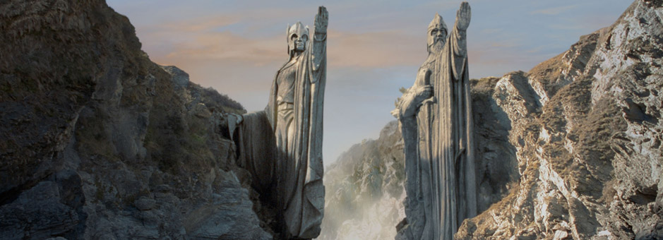
The producer, Barrie Osborne, then moved on to The Lord of the Rings with Peter Jackson.
I had also worked with the Australian DoP Andrew Lesnie, on various colour effects for Babe: Pig in the City. He needed quite a lot of colour work to match time of day and weather: not colour grading in terms of look, it was more in terms of authenticity and consistency.
Andrew Lesnie also moved on to The Lord of the Rings. We were all talking with Peter, and creatively there was the question about how to make New Zealand, with its southern hemisphere light, match England, with its soft northern European light. So based on Barrie’s experience of what I had done with The Matrix and Andrew’s experience with Babe, we came up with the idea that we could colour grade a feature film, but there was no existing software that could handle the demands of a full feature film.
We all went to New Zealand, had some custom code built, and sat down to decide what was colour grading and what was visual effects – what specifically was it we would expect to do when sat in front of this particular workstation. With a brief of what we wanted to do, I commissioned the package to be built.
Because The Lord of the Rings was so intense in terms of colour design we had a team of three colourists grading. I would set the look with Peter and Andrew and define how we would go about the process, and the team would come in and grade the sequences. So ultimately that’s how I ended up being a colourist, in that we went about treating The Lord of the Rings with a kind of visual effects mindset, but it was really about colour.
Certainly it’s always been feature films.
Andrew Lesnie once said to me that films tend to find you, rather than the other way round. I’ve always been attracted to projects that have the visuals as part of the film. Creatively that is very satisfying.
It can be daunting to sit down with a script, meet the DoP and say “OK, what are we doing, what’s the plan?” But grading is a fantastic discipline in that you can make it as technical as you could possibly ever desire in terms of colour science and image processing – or you can make it much more intuitive or creative. To draw on both these disciplines to help tell a story is very gratifying when it all comes together.
The other aspect to it, I guess, is that there’s always a grand plan but it is still quite reactive. Sometimes you sit down and you’ve built a sequence, and it just does not work. Of course you don’t know it doesn’t work until you’ve done it. So typically I’d say you have to grade a film three times. The third time round you always find where it should be.
So how do films find you? What is it that draws people to you? Is it a certain style/way of working?
I think it’s sometimes possibly because I have an opinion about art and sometimes have the technical understanding to work out how to set up a colour treatment. It really is a fantastic challenge and it’s almost like a pursuit to find the essence of a film in terms of visuals.
The best part of the job, and it’s a great honour and intensely stimulating, is to watch a first cut of a film. Because there is really no sound, picture or VFX, you’re watching pure performance without artifice or post production. To sit down with the director and DP and discuss the visual ambitions and hopes for the film is really what interests me.
To be able to support the performance with a grade that is appropriate is a fantastic challenge. Grading can help, or reinforce, what’s happening emotionally between actors. There is always some unpredictability to it, and it’s very good to almost hunt to try and find that unexpected thing that may not necessarily be planned. For instance, someone moved a little closer to a wall, which is bouncing a certain colour, and everyone would comment, “wow, that looks great, let’s take this further”.
So I think it’s partly the idea of working with people who are prepared to just throw everything away, try a look and then try something else and then something else – just to keep working to find what could be. This is perhaps sometimes why I’ve been chosen.
I go back to Alexander Sokurov, the Russian director who directed Russian Ark and Mother and Son. His feature Faust, which won the Venice Film Festival award in 2011, was pretty good because Alexander has been a hero of mine from the early days – we’re talking the essence of Russian cinema in the last 40 years, so to work with somebody who is truly your hero was very special.
It really was film as performance, as opposed to a spectacle. To work in this mindset was edifying – there was a lot of research and reading to understand and to get into Alexander’s world and language. The very way he would describe colour was more like poetry than a brief.
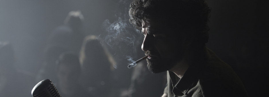
It also meant I worked again with Bruno Delbonnel who was DP for Faust and who I then went on to grade Inside LLewyn Davis for the Coens.
Between the three of us I think we found something quite interesting. Again, the process was interesting, Alexander would do little paintings in the grading theatre to describe how the imagery could look. He wasn’t necessarily treating the film experience in the same way as, for example, a North American studio would.
The other memorable project would of course be The Lord of The Rings. That was just such a brilliant project to work on. Everything kind of came together for a certain period of time so it was down to the atmosphere in Wellington at the time. It was so unique and I don’t think such a thing could be achieved again.
We even had Alan Lee sit in the grading room doing water colours and drawing as colour references whilst we graded.
Overall, it’s really down to the films that have the time or motivation to experiment – they are always the most fulfilling. To try and find what could be. There’s always a magic moment – you just have to work to find it.
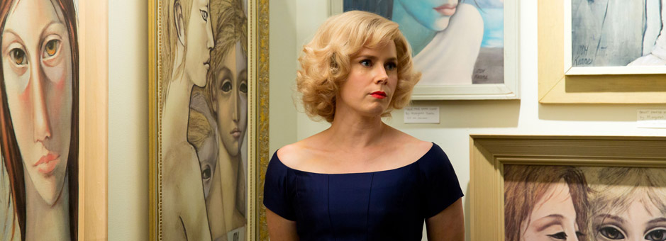
What was the collaboration like between you, Bruno Delbonnel and Tim Burton on Big Eyes?
Big Eyes was pretty much Bruno and Tim’s first feature shooting digital. Tim had done Alice in Wonderland in digital but it was very large VFX movie so quite different.
The first thing we did was run tests, build some LUTs and set up monitoring so it felt similar to film on the technical side. Then Tim offered up some various references and looks that he had in mind. The first week of the shoot I joined Bruno and Tim in Vancouver, and graded various stills from the Alexa camera, responded to the references with my interpretations, just trying to get a feel for what could be.
It is so important for me to be present at that time, as the actors are just finding their characters, production have just finished the sets, and the DP is just finding his light for these sets. Everything is in a state of evolution, so you can still request changes, but more importantly be part of the discussions and understand the motivations. Soon the style gets settled and the lighting package gets built so if you haven’t found it in the first couple of weeks it’s quite difficult to move it.
The rushes were delivered as one light, and then as each scene was finished and JC Bond, the editor, had done a basic assembly, I would then get the raw data up in the Baselight system and start to build different looks. Then Bruno and Tim would review and if we were all happy we would re-grade all the rushes and re-issue.
It meant that all the rushes were in a state of flux, so JC and Tim could re-cut the film without the overhead of having to ask for shots to be graded. So when it came to previews, the Avid cut was in pretty good shape and looking similar to how the final DI could be. This meant that creative partners at the studio weren’t shocked in terms of the film they saw in preview compared to delivery. It also meant the film that was tested and the film that was scored was similar to the film that was finally delivered. Final DI could then be more about refining.When did you start using Baselight? What does it bring to you as a colourist?
We took on Harry Potter 5 with DoP Sławomir Idziak, and it was very important for the rushes to reflect his creative intent. To that end I put together a pipeline for the studio where we could do a DI style colour grade on the rushes. We built a theatre with a very large screen and every morning we would grade our rushes with the DoP.
As there were over a 1,000 VFX shots with creatures and set extensions, it was important for VFX to have the film shot without in-camera filters. Slawomir is possibly the world's master at using filters, and has over 600 of his own custom made filters.
So, we set about rebuilding these looks digitally to be applied after the VFX was complete. It also meant we could supply VFX with an emulation of how their shots would look with their work still in progress.
That meant that when we sat down for the final DI we would call up all those grades and build and refine the looks from there. It also meant we could control VFX. At that time, we looked around the market for a grading package that could offer extreme colour manipulation tools and the ability to integrate custom tools, whatever they may be (because you don’t know what you need until you get there), and be able to carry a database of these grades and to access and control the looks.
This was a 120-day shoot, so we logged over 1.5 million feet of neg, which meant we had on occasions over 30-35 thousand individual grade settings. There are not too many packages around that could really handle this without basically blowing up. And Baselight proved to be the tool of choice as it has the whole colour management concept, advanced grading tools, colour spaces, and it is reasonably open so if we desperately needed something the R&D team could turn it around.
Baselight’s really big plus is the marriage of the colour grading and conforming streams, plus the straight-up data management.
Because grading for me is such a design-intensive process it is common to carry two or three grades of different scenes inthe film right until delivery. It is also common to want to be able run these three versions at the same time. Baselight is the only system around that can handle that without being incredibly painful.
Almost all my deliveries include Imax, 2d, 3d and now HDR. Baselight is the only package that allows me to carry the one timeline and reversion for the different mediums, both in resolution, ratio and colour space.
How does Baselight increase your productivity and creativity?
It does, mainly because it is so customisable. I don’t use a Slate or a Blackboard panel, but that’s OK because for me personally I can work much faster this way. I work quite uniquely, I guess.
And also because of the approach to the system – with the colour management tools and unified colour spaces, I can grade in certain spaces and render, and it is very efficient. For example, we monitor in XYZ colour space and I don’t have to do a render and separate conversion – we’re able to render direct.
In terms of process, it is also absolutely able to increase productivity. And when interacting with clients, yes, I would say so definitely, mainly in being able to carry multiple versions and being able to move between multiple versions of the same film with ease.
Personally, I have always been involved in pre-production.
Interaction with the production design and art direction teams in the beginning has always been important to me, especially having adequate handover with VFX.
Industry wide there seems to be a lot more consultation with the “colour guy”. There is a general understanding that it doesn’t make sense to go out, shoot all this stuff and then sit down with the colourist and just say “OK, this is what we’re thinking”.
You wouldn’t have done that in the film days – there were always lab tests and sorting out printer lights and film stocks.
With almost the entire film being divided between various VFX houses around the world, a centralised colour management pipeline is essential.
The first thing is to not be afraid of technology – really embrace it. That’s not to say you necessarily need to know how to programme or to have a masters in colour science, but to have a strong technical understanding and appreciation. To put it another way, do not discount the technology or the advantages of understanding colour science.
It should be considered a craft as much as being able to match two shots. Certainly the way to think of it is that colour grading is a very manual process – you’re basically matching the colour of shots by hand. If you have an appreciation of the technology, e.g. a Histogram equalizer, you could possibly have the shots matched automatically. Certain processes become much easier.
Secondly try and spend as much time on a set as possible, and learn everything you possibly can about lighting. To understand what goes on before it comes to you means you can then have an informed discussion with the DoP and director. It’s all about knowing your craft.
What makes for a good day at your desk?
Once you’ve finished with a sequence, and you run it, there is an instinctive awareness of whether it is working or not. That’s great when that happens. And it’s purely instinct.
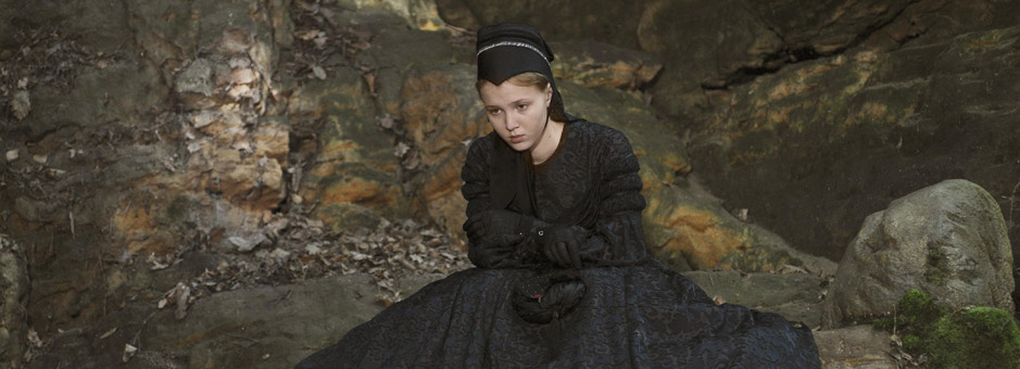
Can you tell us about your work on The Theory of Everything?
It’s always great when a film has a life, and when it finds its audience. And that’s kind of an affirmation of what I was referring to earlier – finding the essence of that film.
James Marsh the director and Benoît Delhomme the DoP really wanted it to look and have something of its own. It was clear what we did NOT want it to look like. It was really good fun to grade a period film with a great sense of journey. It means you can build a colour arc, and that can really contribute to the sense of time and place, going from happy days in Cambridge in the 60s to 70s to almost an ascension at the end.
To evolve a look like this is a great process. Certainly James, the director, deferred to Benoît and myself to do this. And Benoît is a very adventurous DoP, so it was engaging and fun.
How did Baselight contribute to this?
With regards to the grade, I don’t consider colour grading to be just about changing colour. It’s also about changing the sharpness of the image, the density, the texture - the film’s patina. It’s doing something to the image to evoke a certain mood, to try and give the image physicality.
With Baselight, I’m able to work in various colour spaces and have tools such as log blur and sharpen that allow me to manipulate the image in a very compelling way.
For example, FilmLight’s Richard Kirk modified a LAB space for me, which formed the base tool that allowed me to build the colour arc within Theory.
And it might sound nerdy, but the blur in Baselight is incredibly beautiful. You could say we went overboard on The Theory of Everything as there are blurs and flares and all sorts of things that we added to the image. This started in the camera and lenses, and we carried on in Baselight.
From about halfway through the film our lead actor does not speak so the performance was really in the eyes. We were pulling everything we possibly could out of the box to keep the focus on Eddie Redmayne’s eyes. We were sharpening eyes, dropping down backgrounds and more. Because of the way that Baselight does this, it’s a lot less work to get a decent image in those kind of tools. It helped considerably.
So what do you like to do after you have been in a darkened room all day?
Maybe as an over compensation of sitting inside a black box all day, I really love to find absolutely empty desolate spaces. Whenever I have the time, I like to get down to North West Australia, where there are areas where you go without seeing another human being for weeks. Or maybe the Isle of Skye in Scotland.
And I love photography.
If you could have graded any movie in your lifetime, what would it be?
There’s some amazing films that just look fantastic without any digital grading, or anything that I could bring to the table. And that’s more interesting in a way.
There are many, many photographers who have had big impact on my work – Ernst Hass is one, Richard Misrach is another. Gordan Parks, Fan Ho, too.
Ultimately, the Dusseldorf School of Photography is absolutely a strong influence – both for me and for some of the directors and DoPs that I have been lucky enough to work with.
Join In
If you want to participate in our MTC programme, we'd love to hear from you. Contact:
Alexa Maza
e: [email protected]

“The best part of the job is to watch a first cut of a film.
To sit down with the director and DP and discuss the visual ambitions and hopes for the film is really what interests me.”
Details
Colourist: Peter Doyle
Role: Supervising Visual Colourist
w: Technicolor, London